Daily insights for city builders, delivered every morning at 6 AM ET. I’m Brandon Donnelly — a Toronto-based real estate developer and founder of Globizen. I’ve been writing here since 2013.

Tag: architect

  • Gustavo Capanema Palace

    Brazil has been on my travel bucket list for many years, if not decades. Whenever I tell someone that they often ask me why that is the case.

    In addition to its breathtaking natural beauty, sunny beaches, beautiful people, and lively culture, Brazil is also one of the first countries outside of Europe to have adopted modern architecture.

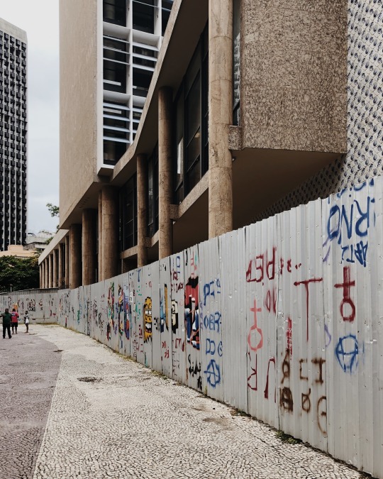
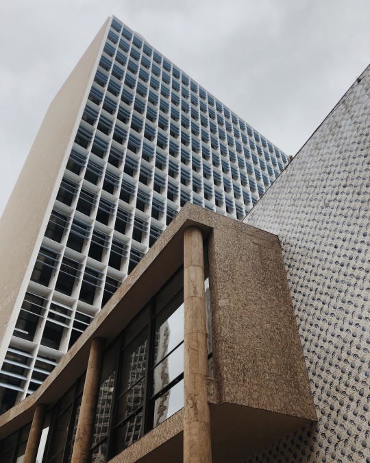
    The best example of this is, arguably, Gustavo Capanema Palace, which is also known in architectural circles as the Ministry of Health and Education Building. At the time of its construction, Rio de Janeiro was the capital of Brazil. Brasilia took its place in 1960.

    Here are two photos of the building from this afternoon:
    imageimage

    Sadly, the building is currently under renovation and I wasn’t able to get as close as I would have liked.

    All the same, Gustavo Capanema Palace is one of the first modernist buildings in Brazil and, apparently, the first modernist government building in all of the Americas.

    Designed in the 1930s, there were a whole slew of architects involved in this project, including Lucio Costa (master planner for Brasilia), Affonso Eduardo Reidy, Ernani Vasconcellos, Carlos Leão, Jorge Machado Moreira, Roberto Burle Marx, and Oscar Niemeyer.

    But most notable in the roster was Le Corbusier. And the building is everything you would expect from the Swiss-French architect. Pilotis. Brises-soleil. Glass facades. And mid-level programming.

    However, it also incorporated local elements, such as azulejos (glazed tilework common to Portuguese and Spanish buildings). And in my view that makes it a more interesting varietal of modernist architecture.

    So even though I wasn’t able to get inside today, I am still glad that I was able to finally see Gustavo Capanema Palace.
  • Unfinished: The Museum of Image & Sound

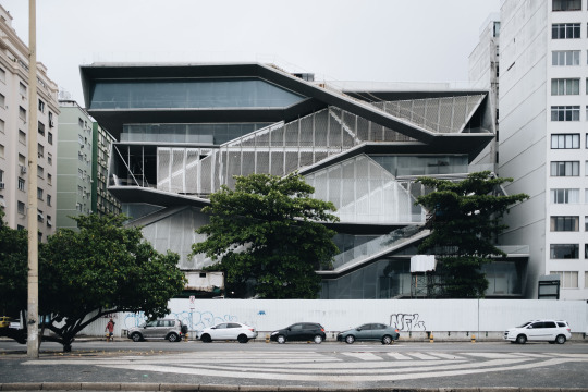
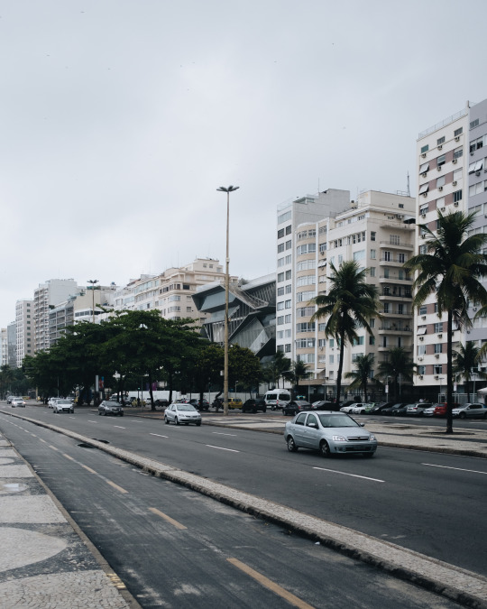
    Here are two images of the unfinished Museum of Image & Sound in Rio de Janeiro by Diller Scofidio + Renfro.

    imageimage

    The building sits across from Copacabana’s famed beach and tiled boardwalk. The street you’re looking at is Avenida Atlântica.

    The idea behind the architecture was to create a kind of “vertical boulevard” on the building’s beachside facade. Clever.

    It is particularly impactful when you see it within the context of Copacabana’s delightfully formidable streetwall and curving promenade.

    But it is unclear when the building will ultimately be finished. Construction started in 2010 and it first stalled in 2012. Too bad.

  • Project Profile: Pavillon du lac

    Over the years on this blog I have posted the occasional “Project Profile”, where I have shared a noteworthy development project, an interesting piece of architecture, or some other kind of project that I thought would interest all of you. Everything is now a project.

    This morning I decided that I should do that more often. I’m not sure if it will be every week, but hopefully it’ll be fairly regularly. I also have a few other alliterative blog series that I have started in the past and should continue.

    This week’s Project Profile is the Pavillon du lac in Quèbec (somewhere) by Montréal-based Daoust Lestage. All of the photography used in this post is by Adrien Williams

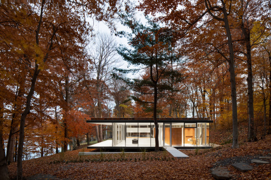
    The first thing you may notice is that it is evocative of Philip Johnson’s Glass House and Mies van der Rohe’s Farnsworth House (1951) – but probably more the latter.

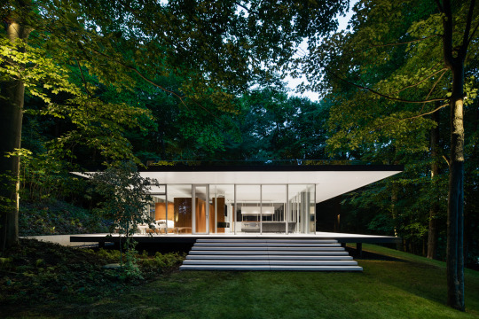
    Le Pavillon du lac was completed in 2015. It has 2 bedrooms and is about 1,240 square feet. The entire glass pavilion is housed between two thin flat slabs with cantilevering overhangs on two of its elevation. They create a kind of portico that frames views of the water. All of the glass is triple-glazed.

    image

    One of the key distinctions for me is how the house sits on the ground. As is the case with the Farnsworth House, le Pavillon du lac sits on stilts, elevated off the ground. The ground floor slab is then able to ignore whatever topography there may be beneath it. 

    image

    At the same time, there are elevations of the house where the ground has been carved into (see below). This creates a small moat around the perimeter and roots the building within the landscape. 

    image

    For more photos of le Pavillon du lac, click here.

  • We’re new here. Find your home.

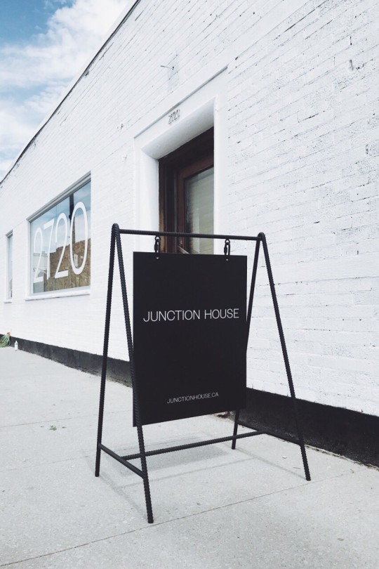
    A simple registration page is now live for our upcoming Junction House (condo) project. We also got this neat sign made:

    Of course, eventually there will be a full website, but this is for people who want to get on the early registrant list and tell us what they are looking for in a new home. Early registration. Early access to suites.

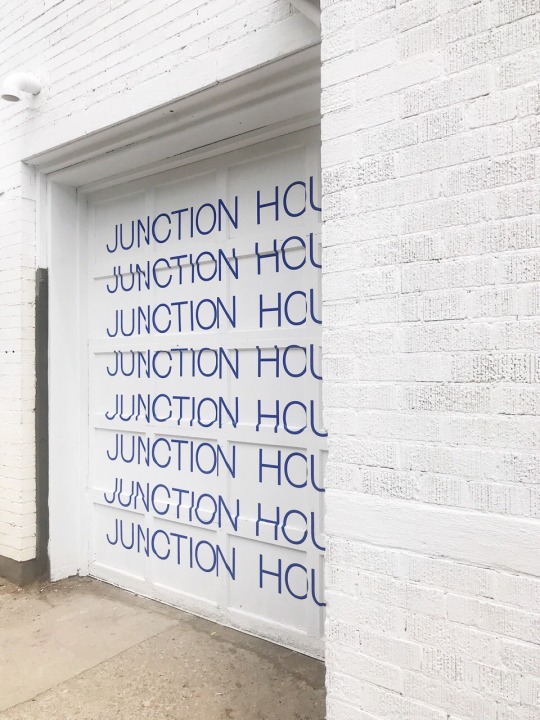
    We’re thrilled with the way the overall brand & identity is coming together for Junction House and we think it reflects the architecture and our project ambitions. 

    Hopefully you all like it as well.

    Photos by Vanderbrand

  • True North by Alain Carle Architecte

    I just recently discovered the work of Montréal-based firm, Alain Carle Architecte. If you aren’t familiar with their work, do yourself a favor and check it out here. They are apparently known for their secondary homes across the country.

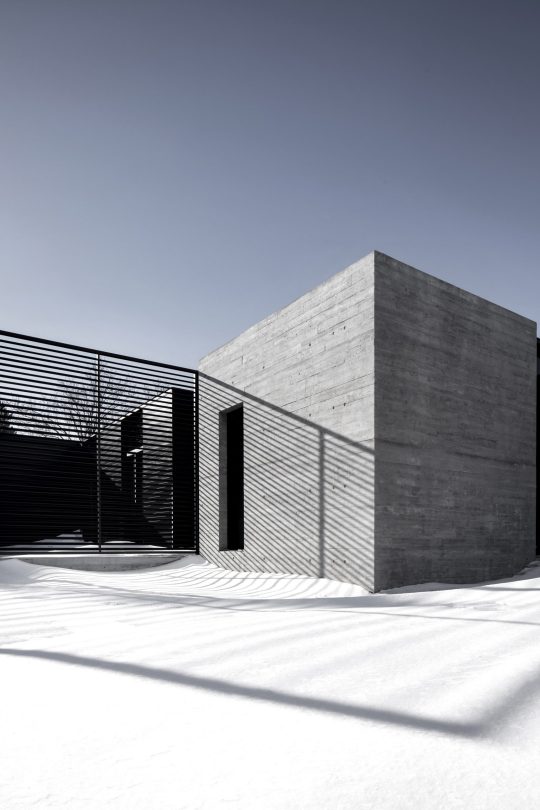
    The project that caught my attention was their True North home in Cornwall, Ontario. Here are two photos by renowned architecture and design photographer Adrien Williams (also of Montréal).

    imageimage

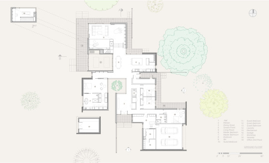
    And here is a plan via Dezeen.

    image

    The concrete and black metal cladding against the snow is pure magic. I also love the way they employed black screens to create a gradient across the landscape and frame some of the outdoor spaces. You really see that in the plan.

    The shadows these screens cast on the concrete are also quite beautiful.

  • “Liberate these objects from their containment”

    Architect Rem Koolhaas recently unveiled a backpack that he designed for Prada’s autumn winter 2018 menswear collection

    It looks like this: 

    image

    It’s more of a frontpack. Actually, maybe the right name is chestpack.

    What stood out for me, though – perhaps more than its frontality – was the way that Rem Koolhaas described his reasoning behind the design.

    Here is an excerpt from Dezeen:

    “Today, waiting in line for a typical airport check of carry-on luggage, it is surprising to note how the shapeless container of the backpack, is inhabited by strict, orthogonal devices like the laptop, the charger, books, toilet bag, and how awkward it is to liberate these objects from their containment in the backpack,” he said.

    “This project proposes a reinterpretation of the backpack, more suitable to the contemporary urban citizen,” he continued. “The frontal position gives a more intimate sense of ownership – a better control of movement, avoiding the chain of oblivious collisions that the backpack inadvertently generates.”

    Leave it to an architect to talk about a backpack like the wearer is about to go to war.

    P.S. I’m a fan of Koolhaas. I just found this funny.

    Image: Prada

  • Empowering food truck entrepreneurs

    When I lived in Philadelphia I survived on food truck food. My go-tos were an egg and cheese breakfast sandwich for $2.50, a bowl of spaghetti for $4.50, and a pretty substantial chicken burrito for somewhere around $5 or $6. The food was good. It was filling. And it was all priced perfectly for a poor student, which I was at the time.

    I still remember when Renzo Piano came to the University to talk about potentially renovating the design school. Somebody stood up and asked if he had considered the placement of food trucks in his plans. Piano responded by saying: “I am Italian. Don’t worry. I will provide for the food.” This is how ingrained food trucks were and are in the culture of the city.

    The other great thing about these food trucks is that they are a low-cost way of starting your own culinary business. Many were run by immigrants. And some of these “trucks” were so small that I used to have to duck in order to make my way to the concession window. There was nothing fancy about them. But they worked.

    These days I don’t really eat at food trucks anymore. They are not as widespread here in Toronto as they are in Philly. I also find them expensive and the portions are usually so small that you have to order 2 or 3 things. They feel like the anti-food truck.

    I appreciate that there’s a growing market for trendy and “gourmet.” But there’s value in low-cost options and in lowering the barriers to entry for aspiring food entrepreneurs. There are numerous examples of humble food trucks growing into full fledged restaurants. Let’s encourage more of that.

  • Skip-stop

    After Junction House was announced, an interesting discussion emerged on Twitter around 2 storey suite designs.

    There are, of course, many examples of multi-level apartments in the city. There’s 75 Portland by CORE Architects. There’s District Lofts and Mozo by architectsAlliance. And there’s Village by the Grange (pointed out during the discussion), which has a number of 2 and even 3 storey suites.

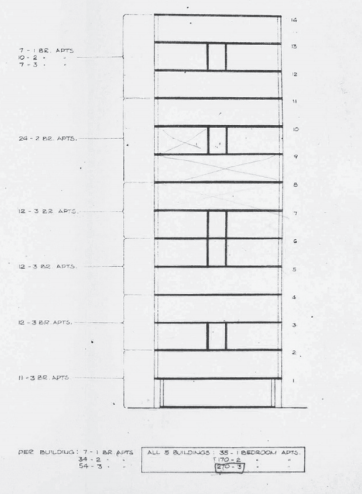
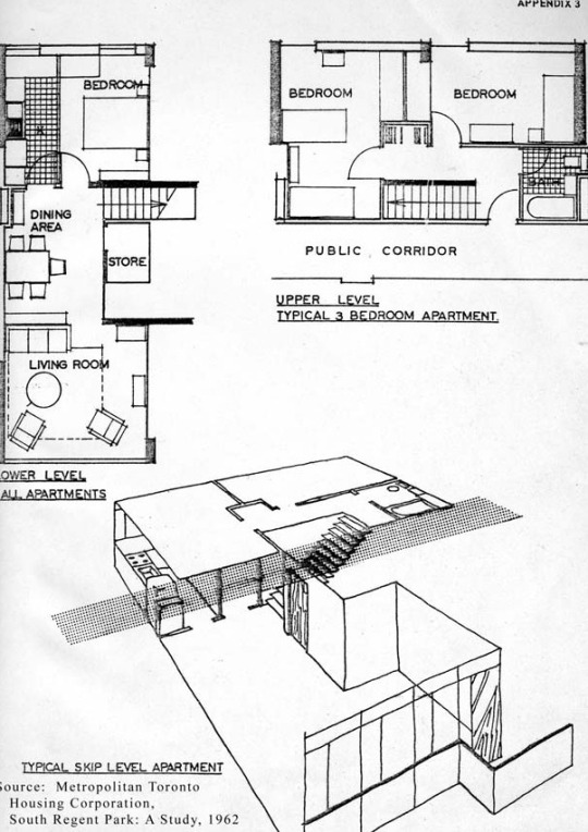
    Another example that was raised by Gil Meslin is 14 Blevins Place. Now demolished, Blevins Place was designed in 1955 and completed in 1957 as part of the Regent Park South urban renewal project. It was designed by the British-born Toronto architect Peter Dickinson and by Page + Steele.

    In 2005, prior to its demolition, the building was identified as a listed heritage building, but it was never elevated to a designated heritage building.

    Perhaps most notable about the building are its “skip-stop corridors” and its 2 storey suites. See below images taken from this Heritage Impact Assessment by ERA Architects.

    imageimage

    The reality is that modern architecture has had a long history of employing multi-level units and skip-stop corridors. Le Corbusier and Oscar Neimeyer were said to be experimenting with them as far back as the 1930s.

    But I think most would agree that Toronto is a very different city today compared to what it was in the 1950s. Some still believe that no child should grow up in an apartment, but I disagree with that belief system. I lived in an apartment as a kid and somehow I survived.

  • Hive by Studio Gang

    image

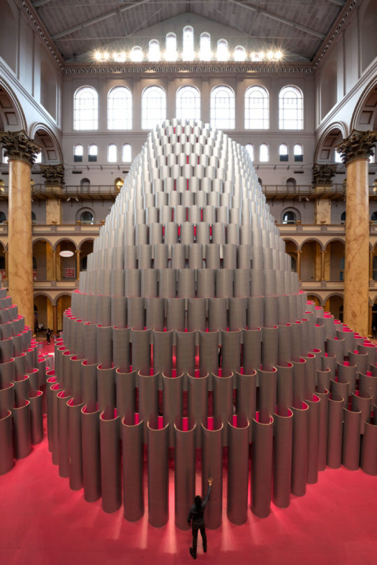
    As part of the National Building Museum’s Summer Block Party, Studio Gang created an installation in the Great Hall called Hive. See above picture. Note the human for scale. 

    Hive is an interactive series of spaces built exclusively out of lightweight and recyclable paper tubes – apparently 2,700 of them. The tubes have a polished silver exterior and bright magenta interior (love that part), and vary in size from several inches to over 10 feet. They are notched together to create a self-supporting structure.

    The installation is beautiful in its own right – especially against the museum’s 19th century interior – but the idea is that each “sound chamber” within the Hive has different acoustic properties. The small chambers create a more intimate setting. And the main chamber is more grand and public. Think group yoga class or concert.

    For more photos of Hive, click here. Below is also a time-lapse of the Hive’s construction. If you can’t see it, click here. (Don’t worry about turning on your sound.)

    [youtube https://www.youtube.com/watch?v=SvJV7m0JOF0?rel=0&w=560&h=315]

    Image: Tim Schenck

  • Fake architect charged on 58 counts

    I had to read the following announcement a few times just to make sure it was legitimate. 

    A few days ago, attorney general Eric T. Scheiderman (New York State), announced that as a result of “Operation Vandelay Industries”, he was indicting an alleged fake architect named Paul Newman on 58 counts of larceny, forgery, fraud, and unlicensed practice of architecture. 

    And yes, the Seinfeld reference was entirely deliberate. Can you believe the guy’s name is Paul Newman? For over 7 years, Newman had been pretending he was an architect and had stamped drawings for over 100 buildings in Albany, Rensselaer, and Saratoga Counties.

    For those of you who weren’t Seinfeld fans (I assume there are some), George Costanza liked to pretend he was an architect, among many other things. He would also sometimes go by the name of Art Vandelay – an “importer/exporter” who ran a company called Vandelay Industries. Hence the operation name above.

    In any event, a funny announcement, but a not so funny reality for the hundreds of clients and building industry professionals that believed Paul Newman was indeed an architect. 

    Moral of the story: It’s one thing to pretend you’re an architect to meet women. It’s another thing to pretend that you actually have the professional ability to stamp building drawings.