Daily insights for city builders, delivered every morning at 6 AM ET. I’m Brandon Donnelly — a Toronto-based real estate developer and founder of Globizen. I’ve been writing here since 2013.
Some four years ago, people were talking about the possibility of New York City being dead. But of course that was nonsense. Last week, New York City published the initial findings of its housing and vacancy survey and the key takeaway is that the city’s vacancy rate dropped to 1.41% last year (2023). This is a drop from 4.54% just two years ago and the lowest measurement since 1968. It’s also even worse at more affordable rent levels:
The problem, as described by the city, is a supply-demand imbalance. Over the last two years, the city’s net housing stock grew by about 60,000 homes (~2%). This is, apparently, pretty good compared to recent years/decades; but it wasn’t nearly enough given that the city added 275,000 new households. This is the opposite of dead, and it’s not going to be addressed by just doing things like restricting short-term rentals.
We have a structural delivery problem and New York City is not alone in facing it.
Well this is interesting, yet not surprising: According to RBC’s annual “Home Ownership Poll”, three out of every five respondents (so nearly 60%) said that location is more important than buying a larger home. Now, there’s only so much you can glean from a single survey question, but the overarching sense is that people’s home-buying attitudes are now starting to revert back to pre-pandemic levels.
Other evidence includes how quickly urban residential rents/prices have bounced back and, in many cases, now exceed their pre-pandemic levels. Below is a chart from the WSJ showing residential net-effective median rent prices in Manhattan. The low came in November 2020 when the median rent price hit $2,743 per month. But today it is well over $3,500, which is the highest it has been in a decade.
Certain aspects of how we will continue to live and work in our cities is admittedly still evolving (see my recent post on office utilization). But part of our pandemic narrative was that location was no longer going to matter, or at least not matter nearly as much. New York City, to give just one example, had died forever. But that was obviously bullshit. And what we are seeing in the residential space is an important leading indicator. Location always matters.
Ottawa, Ontario and Gatineau, Quebec are border cities. They exist on either sides of the Ottawa River. And yet, 2017 data from the Canada Mortgage and Housing Corporation revealed that there’s about a $450 per month rent spread on the average two-bedroom apartment in these two cities. The average rent on the Ontario side was $1,232 per month; whereas the average rent on the Quebec side was $782 per month.
Now, Ottawa is bigger. The city has a population of about 934,243 (2016); whereas Gatineau is about 276,245 (2016). Ottawa is also the nation’s capital, and so the center of gravity is firmly toward the former. But the border is also very porous. Google Maps is telling me that you can walk from downtown Ottawa to downtown Hull (Gatineau) in 30 minutes. So why then is there such a rent disparity?
Is there a language barrier? Is it because income taxes are higher in Quebec? Or is it something else? Interesting.
The Sydney Morning Herald recently reported that an oversupply of apartments has started to put downward pressure on rents and upward pressure on vacancy rates in the city. Here are a few excerpts from the article:
Sydney is in the grip of an apartment building boom, with 30,880 multi-unit dwellings built last year, a record for any Australian city. There were 16 multi-unit projects finished in the first three months of 2019, adding another 1948 units.
These numbers are flowing through Domain.com.au, where 17,500 units were listed for rent in June 2017, and ballooned to 32,680 listings in June 2019. The result has been landlords asking for $25 a week less median rent than last year.
Sydney-wide rental vacancy rates have almost doubled from 1.7 per cent 2017 to 3.2 per cent this year. But on the upper and lower north shore, in the hills district and Sydney CBD, apartments are sitting vacant at more than twice this rate, SQM data shows.
The narrative here is that you can build your way to lower rents. Make supply exceed demand, and this is what will happen.
But in this case, something else has also impacted the demand curve: China.
Beijing has made it harder to get money out of the country in recent years and their overall economy has slowed. China’s economy is thought to be growing at its slowest rate since 1992 (which is when the country started official record keeping).
The above article suggests that about 80% of new construction apartments in Sydney were sold to investors over the last few years. More than a few were probably Chinese. Though I have no idea if that is an accurate number.
What is unclear, to me, is whether this doubling of rental listings over the last two years is a result of previously bought supply simply making its way through the system, or if current market conditions have encouraged more owners to put their units up for rent.
Whatever the case may be, supply is up and apartment rents appear to be coming off slightly in Sydney.
A friend of mine sent me this article earlier today with a sarcastic comment about the relationship between housing supply and rents.
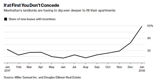
The article talks about how rents in almost every Manhattan neighborhood have fallen compared to a year ago because of a flood of new apartment supply coming online. The median rent dropped 3.6% (year-over-year) which is the biggest decline since October 2011.
There has also been a spike in the number of leases with some sort of incentive attached to it (see above). As a landlord you typically want to use incentives, such as free rent, before resorting to lower face rents. Because lower rents mean a lower overall net operating income, which in turns depresses the value of your property.
But sometimes you have no choice:
“Landlords have finally realized, ‘OK, we have to adjust these prices because the concessions aren’t doing as much,’” said Hal Gavzie, who oversees leasing for Douglas Elliman. “Customers are looking past the concessions being offered and just looking for the best deals they can find.”
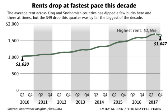
This week I saw it reported that in this decade alone, the Seattle area is set to deliver more new rental apartments than it did in the prior 50 years combined.
And as a result, the sentiment is that new housing supply is finally starting to keep pace with demand and put downward pressure on rents.
In some of the most desirable neighborhoods of Seattle – where much of the new supply is coming online – rents dropped 6% compared to the prior quarter. At the county level, this last quarter was by far the biggest drop of the decade according to the Seattle Times.
Funny how that works.
It’s also worth noting that the US as a whole is building far more rental apartments than condominiums. Here is a post I wrote in August 2015 which pegged condos as a percentage of overall multifamily construction at around 5.5%. That’s a tiny percentage.
Since I’m in the rental business, I thought it would be worthwhile to take a look at the rents – though I tend to obsess over all buildings and not just rental ones.
Firstly, the project has a total of 709 apartments and 178 different unit types because of the architectural variations in the building. Of these units, 142 of them (20%) have been designated as affordable and were offered up via a lottery to people who fall within certain incomes ranges.
I don’t know the exact numbers, but Curbed New York speculated – based on what was seen at other buildings on the west side – that the total number of applicants for these 142 units may have reached over 100,000!
For the market-rate units, the average monthly rents are as follows (via Curbed NY):
Studio: $2,770
One-bedroom: $3,880
Two-bedroom: $6,500
Three-bedroom: $11,000
Four-bedroom: $16,500
I wasn’t able to find average unit sizes (to calculate per square foot rents), but I estimate the overall average unit size to be around 1,000 square feet.
940,000 sf (total gross floor area) – 45,000 sf of retail x 0.80 efficiency (lower than average because of the shape of the building) / 709 units = approximately 1,000 sf of rentable area per unit. That’s just my rough guess based on what I could find online.
If anyone has any additional figures, please share them in the comments below. I think there are a few subscribers to this blog who are involved in the project.
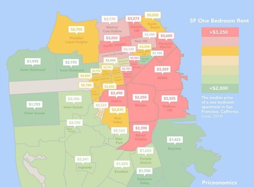
Recently Priceonomics posted a piece on San Francisco’s “rent explosion.” In it, was the infographic above showing the median rental rate for a 1 bedroom apartment in the city. The most obvious takeaway is that San Francisco is real expensive. In the core of the city, you’re easily looking at $3,000 per month.
That is with one exception: the Tenderloin (the green area just northwest of SOMA in downtown). The first time I ever visited San Francisco, I actually stayed on the outskirts of this area, which is a neighborhood well known for seediness, homelessness, crime, drug trade, strip clubs, and so on. And it was actually named after a similar neighborhood in New York that was also a center of vice in the late 19th and early 20th centuries.
But when I saw this diagram, I immediately asked myself: How could it be that the Tenderloin was holding out so well against the forces of gentrification? How is this island of seediness being preserved in the center of downtown? Particularly in a city like San Francisco where there’s a perpetual housing supply shortage and lots of wealth. The Tenderloin has some of the lowest rents in the city.
So I tweeted the good folks at Priceonomics and they responded with this article. It’s a few pages long, but the reasoning seems to come down to the following: active community groups that fought to keep developers out of the area (and that also own many of the buildings), downzoning, and a high percentage of rooming houses. According to that same article, the Tenderloin contains approximately 100 single room occupancy residential hotels (or SRO’s as they’re called). These were initially built to house the city’s transient and seasonal population after the great fire of 1906.
So it would appear that there are some significant barriers to entry.
But at the same time, it generally seems like a bad idea to concentrate poverty, homelessness, drug users, and so on. Interestingly enough, the article talks about how when the Bay Area’s transit system went on strike for a period of time, the supply of drugs actually dried up in the Tenderloin. This underscores how regional the drug business is, but also makes me think that dealers are almost surely benefiting from the clustering of their client base.
In any event, this is a much larger problem than just a real estate development one. I don’t know what the solution should be, but I’m pretty sure that things are being made worse by concentrating everything in one neighborhood and by rising income inequality in the city. Inequality seems to lead to all kinds of negative externalities and, from my experience, mixed-income neighborhoods perform better than 100% poor ones.