Daily insights for city builders, delivered every morning at 6 AM ET. I’m Brandon Donnelly — a Toronto-based real estate developer and founder of Globizen. I’ve been writing here since 2013.

Tag: american cities

  • The new donut

    Years ago Aaron Renn coined an urban paradigm that he labeled “the new donut.” The old donut, of course, is one that many of you will know well: poor downtown (hole in the donut) and wealthy suburbs (ring around the hole in the donut). This is a well documented phenomenon in many American cities.

    The new donut reflects today’s return to city centers. It is the filling in – albeit only partially – of the middle of the donut. The reason I say only partially is because the data clearly suggests that, in many cases, there’s now a trough between the immediate core and the outer suburbs. 

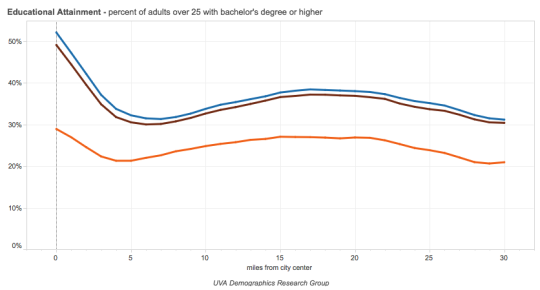
    In 2015, the University of Virginia published a study called The Changing Shape of American Cities. It looked at things like educational attainment and per capita income in 1990 and then compared it to more recent 2012-2015 data. But most significantly, it plotted this data against “miles from city center.” (I discovered this study via City Observatory.)

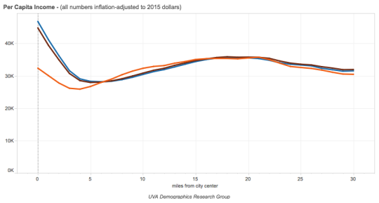
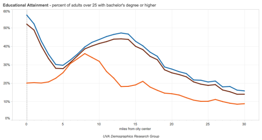
    Here are educational attainment and per capita income for the 50 largest metro areas in the US. The orange line is 1990 data. The brown line is 2012 data. And the blue line is 2015 data. The x-axis is “miles from city center.”

    imageimage

    Compared to 1990, it is clear that there has been noticeable spike in education and income in city centers. For the above composite index, more than 50% of adults over 25 now have a bachelor’s degree. But it has also accentuated the trough that appears to sit, on average, about 5 miles out from the center. 

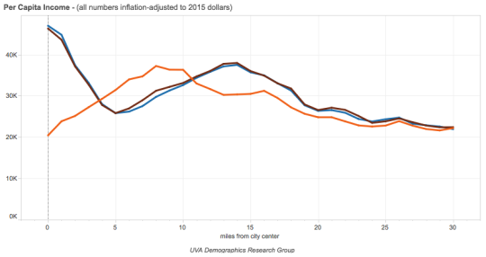
    In some metro areas, such as Charlotte (shown below), there has almost been a complete inversion. Education and income were highest 5 to 10 miles out from the center, but that has since flipped, along with a dramatic spike right in the center.

    imageimage

    This is the new donut. If you’d like to see the graphs for all 66 American cities that form part of the study, you can do that here

  • Young, rich, childless, and white

    Whenever I’m not sure what to write about, I just read. That’s one of the big benefits of daily blogging – it forces me to do that.

    This morning I stumbled upon the blog of Jed Kolko. Jed is an economist and, up until 2015, he was Chief Economist and VP of Analytics at Trulia.

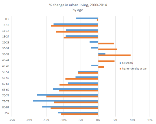
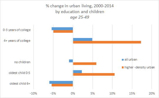
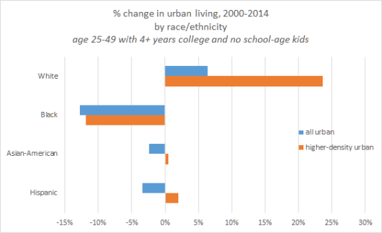
    His most recent post argues – naturally with lots of data and charts – that for all of our talk of (re)urbanization, it’s actually a specific subset of the population that is far more likely to be have urbanized between 2000 and 2014: the young, rich, childless, and white. (Note: His post is talking specifically about U.S. cities.) 

    Below are a few of his charts. 

    In all cases, the x-axis represents % change in urban living between 2000 and 2014. All of the data is from Public Use Microdata Samples (PUMS) – 2000 decennial Census and from the 2014 one-year American Community Survey (ACS).

    Here is age:

    image

    Household income:

    image

    Education and children:

    image

    And here is race/ethnicity:

    image

  • A short history of redlining

    In 1933, the United States Congress created the Home Owners’ Loan Corporation (HOLC). With foreclosures rising as a result of The Great Depression, the task of the agency was to provide new low-interest mortgages to both homeowners and private mortgage lenders. Between 1993 and 1936, the agency served about one million households.

    By 1935, the parent company of the agency (the Federal Home Loan Bank Board) decided to initiate something called the “City Survey Program.” The idea was to look at local real estate trends – including the racial and ethnic composition of the country’s largest cities – in order to get a better understanding of how to manage all of these outstanding loans.

    One outcome of this program was the creation of the HOLC’s infamous “residential security maps.” (Philadelphia’s is shown at the top of this post.)

    These were maps that categorized city neighborhoods according to 4 grades. Grade A neighborhoods (green) were the best ones. They were ethnically homogenous and had room to be further developed. Grade B neighborhoods (blue) were the second-best ones. They were already completely developed, but were still considered desirable. Grade C neighborhoods (yellow) were starting to decline and showed an “infiltration of a lower grade population.” And finally, grade D neighborhoods were considered “hazardous” and colored in red. These neighborhoods had low homeownership rates, old crappy housing, and an “undesirable population”, which, at the time, largely referred to Jews and African Americans.

    Some have argued that the HOLC and their “residential security maps” are what kicked off systematic mortgage discrimination in America’s inner city neighborhoods – later referred to as “redlining.” This was the practice of denying credit to people who lived in these undesirable neighborhoods (and even to real estate developers who wanted to build in these undesirable neighborhoods).

    But University of Pennsylvania professor Amy Hillier has argued that these maps simply reflected the ethos of the time period. Using a sampling of HOLC mortgages, she found that 62% of them were issued to grade D (red) neighborhoods. The agency, itself, was not actually redlining in practice.

    Furthermore, she also looked at private mortgages issued in Philadelphia between 1937 and 1950 and found that security grade rating actually had no impact on the total number of loans issued. She did, however, discover slightly higher interest rates for properties located near and in the bottom security grades.

    All of this is to say that “redlining” is likely not the only culprit for inner city decay. There are other factors at play.

    To that end, the National Bureau of Economic Research recently published a working paper, which I discovered through CityLab, called, “Racial Sorting and the Emergence of Segregation in American Cities.” The key finding here is as follows:

    “Our preferred estimates suggest that white flight was responsible for 34 percent of the increase in segregation over the 1910s and 50 percent over the 1920s. Our analysis suggests that segregation would likely have arisen in American cities even without the presence of discriminatory institutions as a direct consequence of the widespread and decentralized relocation decisions of white urban residents.”

    In other words, it wasn’t just mortgage discrimination; it was also just general discrimination. That actually makes a lot of sense, because, if you think about it, the former couldn’t have occurred without the latter being present.

    Here’s how the research paper puts it (via CityLab):

    “Policies that reduce barriers faced by blacks in the housing market may thus not prevent or reverse segregation as long as white households have the ability and desire to avoid black neighbors.”

    (Note: Most of the information and data used in this post was sourced from the work and research of Amy Hillier.)

  • The Next Urban Renaissance

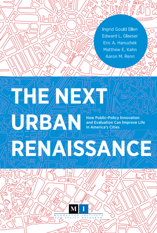
    The Manhattan Institute for Policy Research has just published a free book called, The Next Urban Renaissance: How Public-Policy Innovation and Evaluation Can Improve Life in America’s Cities.

    Here’s an excerpt from the foreword:

    This collection of essays brings together the best ideas from scholars with expertise across a broad spectrum of urban issues. The common theme of the papers is to innovate, evaluate, and leverage the remarkable private talent that is so abundant in America’s great cities. Public capacity is sharply limited; the ingenuity of urban entrepreneurs seems practically boundless. Local governments should be more entrepreneurial and do more to use the talents of the entrepreneurs around them.

    As a further preview, two of the ideas suggested in the book include: 1) reducing or eliminating parking requirements for new developments (which is something I’ve written about before on ATC) and 2) implementing a split-rate property tax for land and its improvements.

    If you’d like to download the free PDF, click here.

  • The housing typologies of American cities

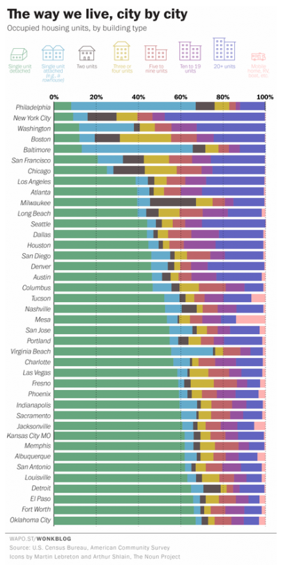
    Yesterday the Washington Post published a great chart showing the housing types of the 40 largest cities, by population, in the US. The list is ordered from lowest to highest according to the percentage of single-family houses in the city (green bar).

    Here’s the chart:

    image

    Not surprisingly, many of the cities at the top of this list (meaning they have the lowest percentage of single-family houses) are in the older east coast cities. 

    It’s also interesting to see just how much the rowhouse dominates the urban landscape in Philadelphia and Baltimore. In Philadelphia, almost 60% of the housing stock is an attached rowhouse.

    Housing is the backdrop for such a big portion of our lives. And when you live in a particular kind of home, it impacts your life whether or not you realize it. The dense rowhouses of Philadelphia and the single-family houses of Oklahoma City are the result of two very different kinds of urban landscapes.

    In Toronto, that backdrop is in the midst of a dramatic change. More and more of us are now living in high-rise condos. That hasn’t always been the case, of course. It’s a recent shift. But it looks like it’ll be a big part of our future.