Daily insights for city builders, delivered every morning at 6 AM ET. I’m Brandon Donnelly — a Toronto-based real estate developer and founder of Globizen. I’ve been writing here since 2013.

  • What is your city’s flag?

    How often do you see it around town? 

    Here in Toronto, I can’t say that I see ours all that often outside of city hall. Am I missing it? Here’s what it looks like:

    image

    In other cities, such as Chicago, the city flag seems to be far more ubiquitous. Here’s what Chicago’s looks like:

    image

    In the case of Toronto’s flag, the two white bands are meant to represent the architecture of Toronto City Hall. The maple leaf is the Council Chamber at the bottom. And there is some suggestion of a letter “T” for Toronto. Wikipedia says the “T” is supposed to be found in the blue space between and above the two towers of city hall, but I’ve always seen the two white bands as being the “T.”

    In the case of Chicago’s flag, the blue bands represent the lake and river (I like that) and the four six-sided stars represent significant events in the history of the city (positioned between the two bodies of water to mimic its actual geography).

    Roman Mars of 99% Invisible has a great podcast and TED talk on this topic. (The study of flags is known as vexillology.) In both instances, he outlines what he believes to be the 5 rules of great flag design. They are:

    1. Keep it simple
    2. Use meaningful symbolism
    3. Use 2-3 basic colors
    4. No lettering or seals
    5. Be distinctive

    Toronto’s flag generally conforms to these rules. But there’s something about the positioning of the maple leaf that makes the flag feel a bit arbitrary to me. I want to rationalize it.

    In any event, I think it could be really interesting if all of us shared our city’s flag in the comment section below and made a comment about how ubiquitous it is within the urban landscape.

    Roman makes the argument that a great flag gives people something to rally behind. And with cities only becoming more important on the global stage, there’s something to be said about having a well-designed flag today.

    I wonder if there will be a correlation between good flag design and ubiquity. My guess: probably.
  • Miami nice

    Art Basel Miami Beach is going on right now so a few of us were talking about it in the office this week. If I had the time, I would have loved to go back this year.

    I think it’s great how Miami (Beach) seems to be infusing art, design, and culture into seemingly everything it does.

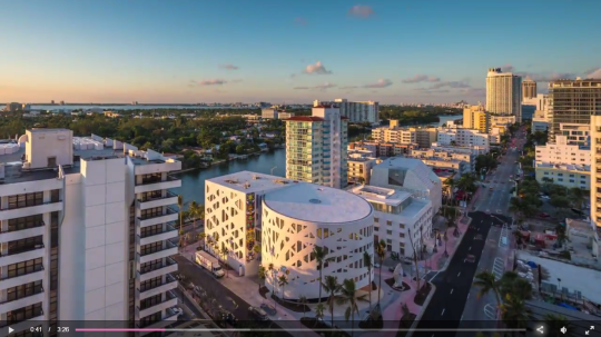
    Here is a really well done video tour of Miami’s Faena District (via Wallpaper*). It’s definitely worth a watch. Screenshot below.

    If you don’t know the story behind Alan Faena, you should also read up. He’s an Argentinian fashion designer turned real estate developer.

  • Below-grade urbanism

    I came across an interesting discussion on Twitter last night about tunnels, bridges, elevated walkways, and Toronto’s elaborate (mostly) underground shopping complex known as the PATH. It’s the largest of its kind in the world.

    Here’s the thing: the idea of pulling people off the street and into an underground shopping mall, runs counter to what many urbanists believe is the optimal outcome.

    Below is a footnote I found in a 2006 research paper by Pierre

    Bélanger called, Underground landscape: The urbanism and infrastructure of Toronto’s downtown pedestrian network.

    “The reluctance of urban designers and academics to engage the
    dynamics of the underground is stunning. For almost 50 years, urban
    designers, landscape architects and planners have longed for car-free
    pedestrian environments that are safe, secure and accessible. From a
    planning perspective, the Toronto underground may be the ultimate form
    of attrition of the automobile on the urban landscape: there are no parking
    lots, no asphalt, and no congestion. With its mass-transit accessibility, it is
    an ideal pedestrian network. This reluctance may in part be attributable to
    a prevailing attitude that privately-controlled underground shopping is
    undesirable, at best dismissible. As self-contained environments, they are
    perceived as lying outside the so-called public domain and that they kill off
    street life. As a more legitimate form of collective space, street-level
    activity located within municipal right-of-ways therefore receives much
    more advocacy.”

    Of course, there is truth to the notion that activity gets concentrated below grade. When people visit Toronto’s Financial District for the first time, they’ll often ask: Where is the retail? And then you have to explain that it’s all underground and that we live like mole people from 9-5.

    But despite this reluctance on the part of urbanists, people do seem to like it. When you’re marketing a building in the CBD, being PATH-connected is a feature, not a bug. I always joke that in the summer, I hate the PATH. But in the winter, I love it. 

    There’s also a feeling of hyper-connectivity during business hours in the PATH – particularly at lunch. You have everyone leaving their desks, descending from their towers, and mixing all about in a dense pedestrian-only network. It’s unusual not to run into someone you know.

    So love it or hate it, perhaps we should appreciate it for what it is: thriving city life.

  • Local rail-driven agglomeration economies

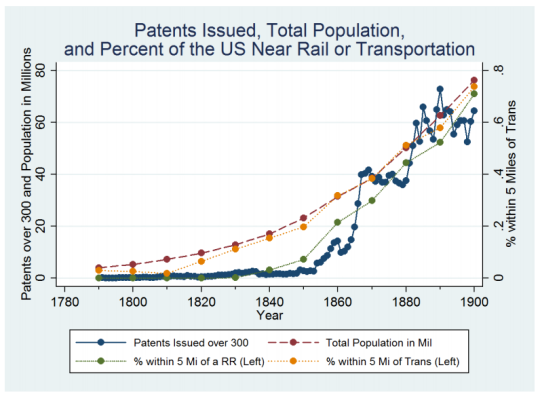
    This morning I came across the below graph in a Medium article by Eric Jaffe of Sidewalk Labs. It is taken from a research paper by Elisabeth Ruth Perlman called, Dense Enough To Be Brilliant: Patents, Urbanization, and Transportation in Nineteenth Century America.

    What this chart shows is patents issued – a proxy for innovation – in all U.S. counties between 1790 and 1900. This data is then compared against access to transport, such as rail. The discovery is a statistically significant relationship between innovation (patents issued) and rail (transport) access.

    The spike in the 1850s (shown above) is as a result of increased rail access.

    But Perlman takes it a step further and asks: what is causing this spike in innovation? Is it because inventors and creators started responding to the larger market now accessible to them because of rail connectivity? Or did transportation somehow improve productivity and the flow of information?

    To answer this question, she dug into the patents themselves (over 700,000 of them) to try and identify how ideas and key words were spreading. What she found is that rail access alone doesn’t encourage innovation. References to new technologies did not increase.

    What mattered was what happened locally. Transportation improvements promoted urbanization and density during her study period, and that’s what drove innovation. Connectivity created agglomeration economies at the local level.

    Obviously a lot has changed since the 19th century. But whether it’s rail connectivity or internet connectivity, have the rules really changed? Place still matters. What happens locally still matters. Perhaps even more. 

    This is an important lesson to consider as we build our cities and invest in transportation. Rail alone isn’t enough. What matters more is what we build around it. Are we dense enough to be brilliant?

  • Thoughts on public meetings

    A few weeks ago I received a community meeting notice in the mail for a new development happening in my neighborhood. I am excited about the project and so I immediately put it in my calendar and told myself: “I’m going to this.”

    But then a work commitment came up and I skipped the event. I always do this. I put these public meetings in my calendar with every intention of going, but then as soon as something else comes up, it gets bumped. So in the end, my voice will not be heard.

    I say this not because I think my singular voice is all that important, but because I suspect I’m not alone when it comes to these community meetings. I live and breathe city building and if I struggle to attend these things, what does that mean for the average resident?

    As soon as you create friction – such as having to go somewhere, physically – you’re going to lose a large segment of people. This also means that only those who are highly motivated will attend.

    I saw this phenomenon play out in my condo building. At our first annual general meeting – when the building still had a bunch of deficiencies and the elevators were spotty – we had a sold out and lively crowd. 

    But as soon as things started humming along in year two (we are now a well-oiled machine), we then struggled to reach quorum. Why show up unless you’ve got a bone to pick, right?

    What was the last public meeting that you attended in your city?

  • Flood-prone areas see dip in real estate sales

    image

    The New York Times has an interesting article up talking about the possible impacts of climate change on coastal real estate in the United States. In it they make the argument that sales velocity is declining in flood-prone areas. Here are two snippets:

    Over the past five years, home sales in flood-prone areas grew about 25 percent less quickly than in counties that do not typically flood, according to county-by-county data from Attom Data Solutions, the parent company of RealtyTrac. Many coastal residents are rethinking their investments and heading for safer ground.

    In the past year, home sales have increased 2.6 percent nationally, but have dropped about 7.6 percent in high-risk flood zones in Miami-Dade County, according to housing data. Many coastal cities are taking steps toward mitigation, digging runoff tunnels, elevating roads and building detention ponds.

    I would like to see more data supporting this argument, but I can’t say I’m surprised. Flood risk is certainly something I would think about – particularly in high-risk areas such as South Florida. Florida has 6 of the 10 most vulnerable urban centers in the US.

    The other piece that caught my attention is this:

    Flood risks are easily overlooked because past flood damage often goes unreported and, as in Virginia, the burden of discovering it falls to the buyer. LexisNexis, a news and legal research company, can supply sellers a report with the history of flood claims on the property, but buyers usually do not know to ask for it. FEMA collects information on federal insurance claims for homes nationally, but the agency has been reluctant to make it public for privacy reasons.

    It is yet another example of how opaque the real estate industry is. A lot of the information – assuming it’s even available – is fragmented across a number of different sources. If you’re playing hot potato, this obviously works to your benefit. But I don’t believe it’s the best thing for the overall market.

  • High resolution population maps

    image

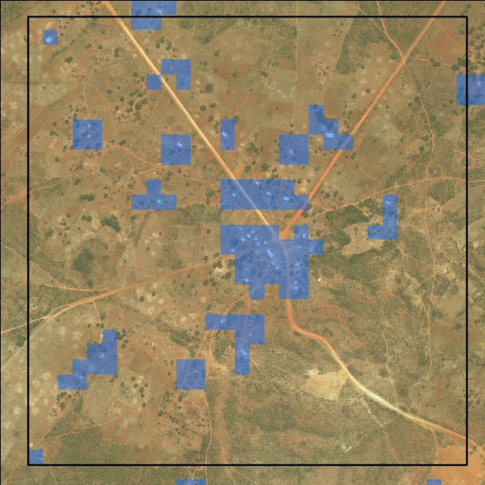
    Facebook, as part of their internet.org initiative, is working on bringing internet access to people in rural areas all across the world. For obvious socioeconomic reasons, this is an important initiative. From a business standpoint, it also grows the base of potential Facebook users at a time where that top line number is starting to plateau.

    In order to understand how people are settling and aggregating throughout the world, Facebook has been using high-resolution population maps and then creating models to drill down and analyze individual buildings. 

    This is interesting because: how else could you track informal settlements? So far this seems to be the most effective method. In fact, in architecture school I worked on a project in Dhaka, Bangladesh and I remember relying heavily on aerial photography because I simply couldn’t find the data I was looking for.

    Here’s an excerpt from a recent World Bank post. They, along with Columbia University, are collaborating with Facebook.

    Facebook’s computer vision approach is a very fast method to produce spatially-explicit country-wide population estimates. Using their method, Facebook successfully generated at-scale, high-resolution insights on the distribution of buildings, unmatched by any other remote sensing effort to date. These maps demonstrate the value of artificial intelligence for filling data gaps and creating new datasets, and they could provide a promising complement to household surveys and censuses.

    And here’s an excerpt from a recent Facebook post on the same topic:

    From this preliminary analysis, we’ve determined that slightly less than 50% of the population lives in cities. However, 99% of the population lives within 63 km of the nearest city. Hence, if we are able to develop communication technologies that can bridge 63 km with sufficiently high data rates, we should be able to connect 99% of the population in these 23 countries. [”These 23 countries” represents about 1/3 of the world’s population.]

    I would imagine that this type of model works better in sparsely populated / low-rise areas. Still, I am very interested in thinking about ways in which our current survey and census methods could be improved. Here in Canada we conduct our national census every 5 years. In today’s world that feels like eons. One day, I am sure, it will be real-time.

    Image: World Bank

  • Show some laneway love

    I just want to do a quick follow-up to my recent post about the momentum currently developing around laneway housing here in Toronto. 

    In the post, I mentioned that two councillors have come out in support of this housing typology. However, I neglected to mention that Evergreen CityWorks is also at the table, as well as a housing advocacy group called Lanescape. It was mentioned in the comments, but I know that not everyone checks that part of the blog.

    I say this for two reasons:

    1) I thought about starting a similar initiative to Lanescape. (I’ve had lanewaylove.com registered for many years. Brand identity shown above.) But after meeting one of the Lanescape founders this past week, I think it only makes sense for me to instead throw my support behind them. They are accomplishing a lot in this space.

    2) Lanescape has a survey up on their website and the results will be used to guide a laneway suite planning framework that will (hopefully) be implemented by the City of Toronto. So I wanted to encourage you all to complete it. Even if you don’t live in Toronto, still fill it out. It’s important for cities to learn from each other.

    Your support will go a long way in making laneway housing a reality in the city.

  • Yellow trees

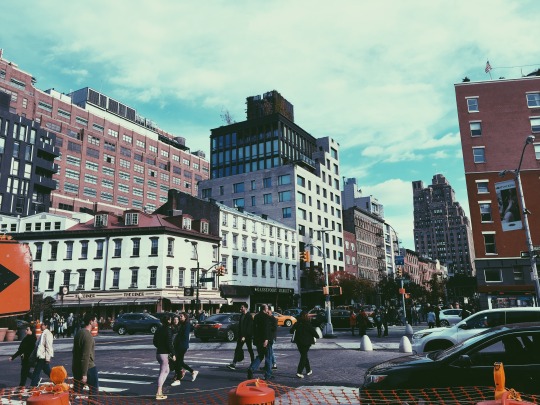
    I took this picture on a recent trip to New York:

    image

    I liked the mid-block building and so I wanted to document it. That’s what I do when I walk around a city.

    When I went back to research the project later on, I then discovered that it was developed by DDG Partners, which I have been following for years. I think they do terrific work and I love their vertically-integrated approach to real estate development. Two years ago I mentioned them in a post called: 3 architects operating as developers.

    If you’d like to learn more about the project, you can do that here. It’s called 345MEATPACKING. 

    What I want to talk about today is how they wrapped the building during construction. Working with the Japanese artist Yayoi Kusama – who at the time had an exhibition going on at the Whitney – they created a 120-foot reproduction of her painting Yellow Trees.

    Here’s a video of what that looked like (c. 2012). If you can’t see the video below, click here.

    [vimeo 79792779 w=640 h=360]

    What a great idea. But don’t tell anyone. I want to steal the idea for one of my projects.

  • Toronto mayor proposes road tolls, finally

    When I wrote yesterday’s post about road tolls, it hadn’t been announced that Toronto Mayor John Tory was going to call for road tolls on both of the highways coming into downtown. That didn’t leak until late in the evening. So I was just writing another post on a topic that I care about.

    Today, however, that announcement was made and the proposal is a flat $2 toll on both the Gardiner Expressway and the Don Valley Parkway. It is expected that this could bring in close to $200 million a year in new revenue for the city – all of which would be dedicated towards transit and roads. Good.

    First, I want to applaud the mayor for coming out in support of road pricing. I didn’t agree with him on the Gardiner East, but I agree with him on this – mostly. It is a bold move.

    The reason I say mostly is because I hope that we don’t simply default to a fixed and blunt road toll. There are more sophisticated options out there, such as variable pricing models that change based on demand/congestion levels.

    Here’s a post that explains how that works and why I think it’s a good model.

    With this approach, it becomes more of a congestion charge rather than a toll. It also gives commuters the option of driving during off-peak times to save money. And if we implemented something like this, I am sure that we would see employers and office hours adapt. More on this in the above post.

    Still, I absolutely believe that it’s a step in the right direction for this great city. So thank you Mayor Tory.