Daily insights for city builders, delivered every morning at 6 AM ET. I’m Brandon Donnelly — a Toronto-based real estate developer and founder of Globizen. I’ve been writing here since 2013.

  • Likely to liquefy in an earthquake

    Today’s post is going to be a short add-on to yesterday’s post about the sinking Millennium Tower in San Francisco. Today, the New York Times published the below map showing the areas of the city likely to “liquefy in an earthquake.” It goes on to note that “at least 100 buildings taller than 240 feet were built in areas that have a “very high” chance of liquefaction.”

    The article might leave you with the feeling that current building codes are inadequate for the pending “Big One” in San Francisco. So I thought I would reblog this post from last fall which talks, in more detail, about how one of the best structural engineering firms in the world designed the tallest building in San Francisco.

    Image: New York Times

  • Sinking tower solution

    Many of you are probably aware of the 58-storey Millennium Tower in San Francisco which is estimated to have sunk about 17 inches and to have tilted about 14 inches to the west since it was built.

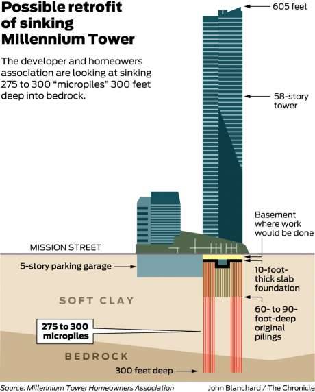
    Well today it was announced that they may have a fix. Here is what is apparently being proposed as a retrofit (image from SFGate):

    image

    The tower was originally built on top of a 10 foot thick raft or mat foundation, which was then supported by concrete piles that went down 60-90 feet into soft clay. Notably, the piles didn’t reach bedrock.

    The proposed solution involves drilling 275-300 new micropiles into the bedrock below. But here’s where things get really interesting: The plan is to stabilize the west side of the building first and allow the east side of the building to continue sinking. In theory, this will give the building an opportunity to level out before they fully stabilize it. 

    According to SFGate, the entire retrofit is expected to take anywhere from 2 to 5 years, and cost somewhere in the range of $200 to $500 million. The original tower cost $350 million to build. (I’m assuming that’s just the hard cost number.)

  • Hamilton’s Pier 8

    In December of last year, the City of Hamilton launched an RFP process to find a team (from the list of prequalified bidders) to develop a new urban community at Pier 8 along the waterfront. The ambition is somewhere around 1,500 new residential units and approximately 13,000 square meters of commercial and institutional space.

    That process has narrowed the pool to 4 teams and 1 will ultimately win the exclusive right to develop the new community. Here are the teams, along with a link to their submission materials, including a short video that I understand was a requirement of the RFP.

    – GulfDream (link)

    – Tridel (link)

    – Urban Capital / Core Urban / Milborne Group (link)

    – Waterfront Shores (link)

    This is a super exciting project for Hamilton. So I would encourage you to take a look at the presentation materials. At this point, you only have until Tuesday, April 17, 2018 to provide any comments to the City’s evaluators. If you’d like to view the boards in person, you can do that this Monday and Tuesday in the main lobby of City Hall.

  • Going down east

    I live in Toronto. 

    When I am headed north to cottage country, I say that I am going up north.

    When the Florida snowbirds talk about escaping the winter, they usually say that they are headed down south.

    These geographic references are fairly straightforward.

    If a friend were to move to Vancouver, I might say that she or he moved out west. This one starts to get a bit more interesting because it speaks to a location that is out, or away, from the center. Toronto is the center and that person has moved out from it.

    But the one that really made me think was down east. My mother was born in the Canadian Maritimes and when she references this part of the country she calls it down east. 

    I used to ask her: “Why is it called down east? Geographically, it is actually up east.”

    Turns out that down east is (probably) a nautical reference. It is used to identify parts of the east coast in both New England and Canada. The prevailing winds in these parts blow from the southwest. So when sailors traveled from the west to east they were going downwind.

    So there you have it. Do you have any peculiar geographic references in your part of the world?

    UPDATE: I should have also mentioned that the St. Lawrence River generally flows north-easterly and that there’s an elevational difference between what was formerly known as Upper Canada and Lower Canada.

    Photo by Matthias Jordan on Unsplash

  • How elevation impacts risk taking

    image

    There’s an old saying that we shape our buildings and environments and then they in turn shape us. 

    Here is a fascinating research report about “the influence of physical elevation in buildings on risk preferences.” I discovered it through this MarketWatch article, which my friend John forwarded me this afternoon. 

    Here is a quote from the article:

    We then examined the correlation between hedge-fund volatility and office location in terms of number of stories above ground. We found that as the elevation of hedge-fund managers’ offices increased, they were more willing to take risks that resulted in more volatility. This was true even when statistically controlling for factors such as total assets, fund strategy and several other variables that could have led more resourceful hedge funds to occupy expensive offices that are often found on higher levels of buildings.

    Does this mean taller cities are also more volatile cities? Assuming this is all true, it once again proves that we are maybe not the rational decision makers that many us probably think we are.

    Photo by Hala AlGhanim on Unsplash

  • Regional accents and “da Bulls”

    I find regional accents fascinating. 

    I generally think that Toronto has a fairly neutral accent. But then again, when I lived in Philadelphia, I used to notice the accident every time I came home. Maybe it is because I had adopted a bit of the Philly accent. For the record, I never picked up “youse.”

    According to some classifications, most of Western and Central Canada would fall under “General Canadian.” But I find that there are noticeable differences between the accents in Toronto and, say, Calgary. Really there are differences even within the Greater Toronto Area.

    CityLab has a recent article up about why city accents are fading in the US midwest. They chalk it up to two main factors: education and geographic mobility. But I also wonder if today’s online connectivity isn’t muting some of the local varietals.

    That’s the interesting thing about accents, they – much like the language itself – are constantly changing and evolving. On that note, I’ll end with this classic parody of the Chicago accent: Da Bulls!

  • New York City’s retail vacancy problem

    The New York Post has some interesting articles, here and here, on the growing retail vacancy problem in NYC. (Thank you Michael for the link in the comments this week.)

    The vacancy rate on Amsterdam Avenue in the Upper West Side is said to be around 27% and it is said to be around 20% on a stretch of Broadway in Soho. It has become such a problem that Mayor Bill de Blasio wants to implement some sort of retail vacancy tax:

    “I am very interested in fighting for a vacancy fee or a vacancy tax that would penalize landlords who leave their storefronts vacant for long periods of time in neighborhoods because they are looking for some top-dollar rent but they blight neighborhoods by doing it,” he said on WNYC. “That is something we could get done through Albany.”

    But this is based on the assumption that greedy landlords are simply holding out for exorbitant rents. It doesn’t consider the fact that, maybe, there is simply too much retail space:

    Only a few grasp the true scope of the problem. Vornado Realty Trust titan Steven Roth said we can only cure the national plague through “the closing and evaporation” of up to 30 percent of the weakest space — which would take five years.

    All of this, of course, has me thinking about the future of ground floor main street retail. What are your thoughts?

  • The golden era of Canadian graphic design

    Over a year ago I wrote about a Kickstarter campaign that wanted to make a documentary to celebrate “the golden era of Canadian graphic design.” 

    And after I wrote about it, my friend Dave Wex – who, like me, is a lover of all things Canada – backed the project. Yesterday he flipped me the latest update. 

    The trailer is out and the world premiere of Design Canada is scheduled for Wednesday, June 13, 2018 at the Hot Docs Cinema here in Toronto. After that, it will move to Montreal and Vancouver. 

    If you can’t see the trailer below, click here.

    [vimeo 263571655 w=640 h=280]

    Tickets available, here.

  • 11 Hoyt, Brooklyn

    Tishman Speyer just unveiled a new condo project in Brooklyn called 11 Hoyt. And it just so happens to be Studio Gang’s first residential project in New York City. Preview above. More renderings over here.

    It’s a 51 storey condominium with 480 residences and 55,000 square feet of indoor and outdoor amenities. The unit mix ranges from studios to four-bedroom residences, and prices range from $600,000 to over $4 million (USDs, of course).

    If you’re from Toronto, you’re probably looking at the renderings and thinking to yourself: “There are no balconies or outdoor spaces.” But that’s fairly typical in the NYC market, as I understand it.

  • Income sorting by city

    This is a fascinating study by Issi Romem about the characteristics of cross-metropolitan migration in the United States. The key findings are that in-migrants to expensive coastal cities tend to have higher incomes and more education than the out-migrants, and that the opposite is true for the less expensive cities in the US. “Expensive” means expensive housing.

    Here is the income chart:
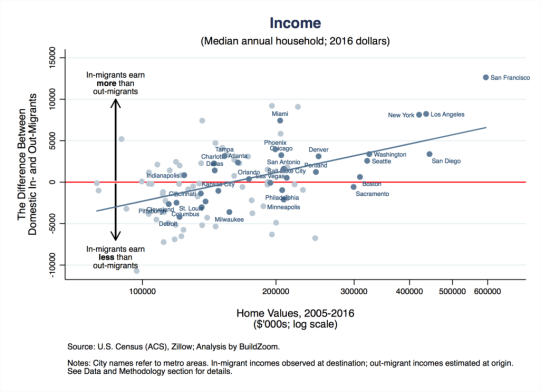
    Let’s use San Francisco as the example since it’s the most expensive metro (all the way to the right on the x-axis). The way to read this is that on average, from 2005 to 2016, in-migrants to the San Francisco metro area earned $12,640 a year more per household (y-axis) after they arrived compared to out-migrants before they left. This chart shows the difference between in and out incomes.

    Take note of Miami which is sitting at a similar place to New York and Los Angeles on the horizontal income line, but has home values similar to Phoenix, Chicago, and Philadelphia.

    Now here’s the education chart:
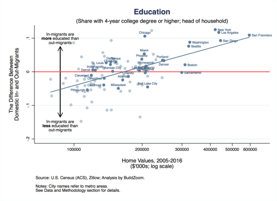
    Similarly, it is showing the difference in educational attainment between in and out migrants.

    So what does all of this tell us? 

    Well, it tells us, among other things, that US metros are continuing to sort based on income and that this process of polarization is probably contributing to home price appreciation. Because even if the incomes of current residents aren’t growing, these “expensive cities” are effectively swapping out poorer residents for richer ones. That, alone, would mean more money for expensive homes.

    For Issi Romem’s full article, click here.