Daily insights for city builders, delivered every morning at 6 AM ET. I’m Brandon Donnelly — a Toronto-based real estate developer and founder of Globizen. I’ve been writing here since 2013.

  • Where are all the kids?

    This evening, when I was reading the internet, I came across this New York Times article from 2017 talking about how San Francisco has the lowest percentage of children of any of the largest cities in the U.S. It’s around 13% of the population. (Supposedly it was the second lowest in 2015. Pittsburgh was first.)

    The article goes on to claim that the city has approximately the same number of dogs as it does children. That number is somewhere around 120,000. Not surprisingly, many blame the city’s prohibitive housing costs as the main culprit for the lack of kids. Families simply cannot afford to live in the city.

    This got me searching for more information. Richard Florida looked at similar data back in 2015, but it’s important to note that he looked at metro areas and not the city propers. So the data doesn’t speak to whether families were forced to move out from the urban core to the suburbs in search of more affordable housing or for more space.

    Nevertheless, he finds no statistical association between the share of children in a city and things like urban density, economic output per capita, or median home prices. He instead finds that the share of children is positively correlated with two main factors: immigration and with ethnicity – specifically people of Latin origin.

    Click here if you’d like to read the rest of Florida’s analysis. And if any of you have additional data on this topic, please do share it below. I think I’m going to continue digging into this question of kids and cities.

    Image: Photo by William Bout on Unsplash
  • Photography heli tour

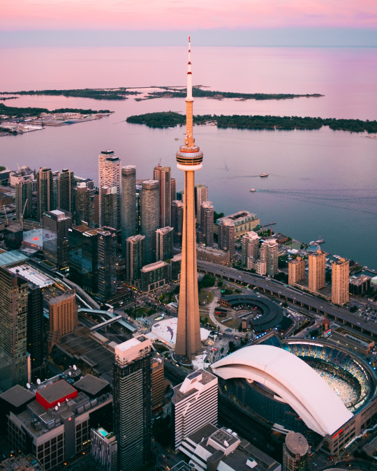
    Tonight I went a photography heli tour with @normandthegang

    I took almost 500 photos, including a bunch of aerials of our development sites. And we got lucky with a pretty spectacular pink sunset. 

    Here is a photo that I took of the CN Tower with my Fuji X Series (35mm prime lens):

    Lake Ontario actually looked like that. This is not post-production chicanery. Follow me on Instagram to see the rest of the photo series.

    Thanks again for the invite Norm. That was a lot of fun. 

  • How New York City became boring

    image

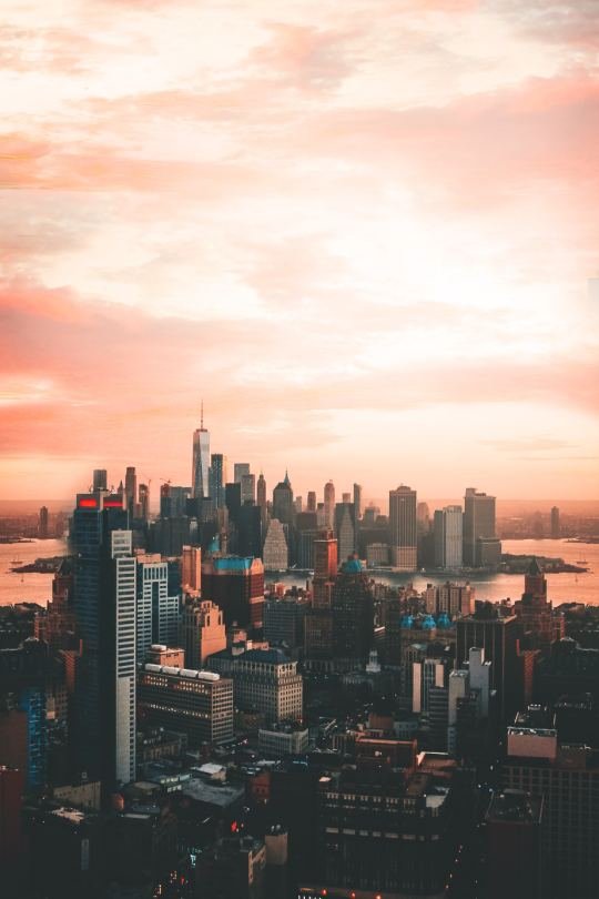
    On the cover of the July 2018 issue of Harper’s Magazine is a picture of New York City – with Rafael Viñoly’s 432 Park Avenue as the focal point – and the title: Death of a Great American City. New York and the Urban Crisis of Affluence.

    The long-form article is by Kevin Baker and it is an account of how New York City has transformed itself over the past few decades from a place of culture and character (and of cockroaches and discarded crack vials) into a place for the ultra-wealthy to buy ultra-luxury real estate that may or may not sit empty for more often than it is occupied.

    “As New York enters the third decade of the twenty-first century, it is in imminent danger of becoming something it has never been before: unremarkable. It is approaching a state where it is no longer a significant cultural entity but the world’s largest gated community, with a few cupcake shops here and there. For the first time in its history, New York is, well, boring.”

    This narrative and/or phenomenon is of course not unique to New York City, though it is surely more pronounced when you are one of, if not the, preeminent global city. In fact, I was sent this article by a reader who was wondering about the possible parallels here in Toronto. Thank you Natasha.

    The desire, which is how Baker ends his article, is that New York City should be a city of “workers and eccentrics” as well as “visionaries and billionaires.” It should be a place for “street photographers” and “hedge fund operators.” That sounds like a pretty cool place to me.

    But we all know how challenging this has proven to be for cities.

    Photo by Dean Rose on Unsplash

  • Traffic signal inequality

    image

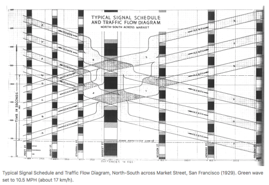
    David Levinson, who is based Sydney and authors the Transportist – a blog you should follow if you don’t – has a recent post up about signalling inequity and “how traffic signals distribute time to favour the car and delay the pedestrian.” In it he provides some background into traffic signal coordination (introduced in New York City in 1922), as well some some suggestions for how we could and should be prioritizing pedestrians.

    Here is an excerpt from the article:

    There is a reason that traffic engineers don’t automatically allocate pedestrian phases. Suppose the car only warrants a six second phase but a pedestrian requires 18 seconds to cross the street at a 1 meter/second walking speed. Giving an automatic pedestrian phase will delay cars, even if the pedestrian is not there. And there is no sin worse than delaying a car.  But it also guarantees a pedestrian who arrives just after the window to push the actuator passes will wait a full cycle.

    Sometimes pressing the walk button appears to do nothing. I suppose that’s why some cities call it the “placebo button.” And in other cases if you don’t press the walk button you’ll never get a walk sign. That’s usually a strong indicator that you are located in an environment not intended for pedestrians. David’s article also has me curious about the relationship between traffic signals/pedestrian phases and urban form. I bet you could tell a lot about the latter simply by understanding the former.

    Image: Transportist

  • SoCal Googie

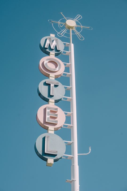
    I must have been sick for this lesson in architecture school, because I just discovered, through Curbed, that there is a subset of mid-century modern architecture known as Googie. It originated in Southern California in the 1940s and was all about the future, car culture, the Space Age, and the many other things that dominated the postwar years. Think starbursts, curvaceous geometric shapes, and bright colors. We all know the architecture. But did you know it was called, Googie?

    Supposedly the Googie movement was given its label by architecture critic Douglas Haskell, who used it in a derogatory way to describe criticize the architectural fashion at the time. Googie was the name of an actual coffee shop in West Hollywood designed by John Lautner. And that’s something that is noteworthy about Googie. It was a form of architecture for average buildings: coffee shops, gas stations, motels, and those sorts of things.

    There will always be critics who eschew that which is fashionable at the time. I suppose one could argue that if you’re being fashionable, then you’re not being timeless. Because fashion is about what’s current. And good architecture should be timeless, right? But there’s something so fascinating about a kind of built form that perfectly captures a particular time and place. Middle of the 20th century. Car-oriented Southern California. 

    Sometimes good architecture and design also needs a bit of time and distance in order to fully appreciate it. What was once garish may one day become treasured. Just give it a generation or two.

    Photo by ian dooley on Unsplash

  • 2720 Dundas Street West

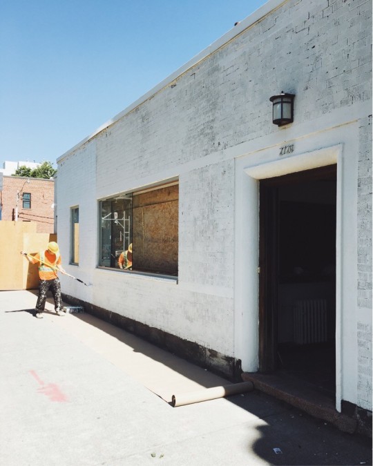
    If you’ve been in the Junction lately, you have probably noticed some activity at the location of our proposed Junction House. Here is a photo that I took this morning of 2720 Dundas Street West. (Sidebar: What an absolutely gorgeous summer day in Toronto.)

    image

    We’re giving the front a coat of fresh white to mark the beginning of the registration phase. Pretty soon you’ll be able to leave your name with us so that we can send you insightful emails and get in touch with you when condo sales begin. 

    At some point 2720 will become home to the Junction House sales office (maybe we’ll even call it something pretentious like a presentation gallery). But that point is not right now. 

    I can, however, tell you that in addition to superkül (architecture), we are working with Paul Johnston / Unique Urban Homes (sales), Dialogue 38 (interior design), and Vanderbrand (creative agency). 

    I am also personally spending a lot of time obsessing over kitchen details and other minutia. I think Charles Eames once said, “The details are not the details. They make the design.”

    If you’d like to be kept in the loop on Junction House, you can follow Slate Developments (nascent account), the Globizen Group, and myself on Instagram. And of course, you’ll also hear all about it on the blog. Have a great weekend friends.

  • Car-dependent spatial structure

    Earlier this week a 58 year old woman named Dalia was struck and killed by a car near the University of Toronto’s downtown campus. This tragedy has everyone talking about and questioning how to make our roads safer, though the answers are not difficult to find. Here is an excerpt from a piece that Richard Florida penned following the incident called, Toronto’s Deadly Car Crisis:

    Today, more Torontonians die from being hit by cars than from being killed by guns. In 2016, nearly 2,000 pedestrians and 1,000 cyclists in the city were hit by cars. Of these, 43 resulted in fatalities. On average, a pedestrian in Toronto is hit every four or five hours, and a cyclist every eight or nine. This means that Toronto’s rate of pedestrian deaths was 1.6 per 100,000 people in 2016 — worse than in Chicago, Seattle, San Francisco, Boston, Washington, D.C., Portland, Pittsburgh, Cleveland, and Buffalo. It has risen to 1.7 deaths per 100,000 people in 2017 and is on track to rise still further to 1.8 deaths per 100,000 this year. And, children and the elderly face the greatest risk of being struck and killed by a car. The problem is only getting worse. Across Canada, pedestrian fatalities increased by more than 10 percent between 2010 and 2016; at time when they decreased by more than 25 percent in European countries like Norway, Switzerland, and the Netherlands.

    The broader issue is what he refers to as Toronto’s “car-dependent spatial structure.” And it is detrimental to not only our public safety, as we saw this week, but also to our ability to grow as a global city. The Greater Toronto Area is projected to reach 10 million people by 2041. I agree with Florida that, for a number of important reasons, we are going to need to commit ourselves to a new model for growth.

  • What to do about Hong Kong’s land supply problem?

    My friend Jeremiah shared this ULI article with me this morning, which talks about Hong Kong’s land supply problem. The interesting thing about this problem is that only 9.3 square miles of the city’s land (out of ~424 square miles) is actually developed (and about 60% of the region’s area is water). The rest has been preserved for parks, farmland, and so on. And that is certainly a remarkable characteristic of Hong Kong. It doesn’t take very long to escape its hyper-urbanism and be in the countryside.

    Preserving greenspace is of course vital. But at what point do population and growth pressures justify the unlocking of some of that land for development? This is the question that Hong Kong appears to be asking itself. At the same time, it is looking at developing other islands (such as Lantau, which I understand is a pretty lush place); reclaiming (i.e. creating) additional land; and positioning the city as part of a planned “Greater Bay Area.” 

    If it were up to you, how would you suggest that Hong Kong deal with these pressures? The city is already fairly adept at building up.

    Photo by Annie Spratt on Unsplash

  • The Korean Peninsula

    I just spent the last 7 minutes listening to this brief historical overview of Seoul by The Urbanist, while I bounced around the city on Google Street View, admiring the coverage of their transit network and the density of their low-rise neighborhoods. 

    I love Street View and I love using it to explore cities.

    One of the things I liked about The Urbanist episode –  beyond it being a good soundtrack while I explored – is that it talks, albeit briefly, about why Seoul is located where it is today. 

    I am always curious about this when it comes to cities. I mean, who was it that decided, yup, this is going to be the spot. Because it’s generally a pretty sticky decision once it is made.

    You may also find this 2014 NASA photograph of the Korean Peninsula interesting. The nighttime sky renders up a pretty stark contrast between North Korea and South Korea.

    According to NASA, per capita power consumption in North Korea and South Korea is 739 kilowatt hours and 10,161 kilowatt hours, respectively. That’s why the satellite photo looks the way it does.

  • Doing stuff vs. owning stuff

    “People get income for doing stuff, and they get income for owning stuff. Increasingly the latter. And the ownership share of income goes to a small slice of households that own almost all the stuff.”

    This is a quote from a recent article by Steve Roth over at Evonomics, where he breaks down the share of US household income that is derived from “labor” vs. “capital.” In other words, how much money do households make from working (trading their time for money) and how much do they make from their existing wealth (that is, owning stuff)?

    If I were to oversimplify how he calculates this (you can read all of the details, here), it is: (Income – Labor Compensation) / Income. Take all of the household income. Subtract the money made from doing stuff. And then divide it by total income to get the percentage made from “unearned property income.” There are gray areas and others things to consider, but that’s the gist of it.

    What he discovers and argues is that basically 50% of household income comes from simply being wealthy and owning stuff. He also reminds us that approximately 60% of US wealth is… “earned the old-fashioned away: it’s inherited.”