Daily insights for city builders, delivered every morning at 6 AM ET. I’m Brandon Donnelly — a Toronto-based real estate developer and founder of Globizen. I’ve been writing here since 2013.

  • Eight centuries of global real interest rates

    Levered assets, such as real estate, tend to have prices that are correlated with interest rates. Lower rates usually translate into higher asset prices. We are living through this kind of environment right now. And so it is generally valuable to have a view on where rates might go next.

    To do that, it can be helpful to look back at history. And a lot of the time, that look goes as far back as the second half of the 20th century. I wasn’t buying real estate in the 1970s and 1980s, but I am often reminded — by people older than me — that this was a period of high inflation and high interest rates.

    But what about an even longer period of time?

    Paul Schmelzing (visiting researcher at the Bank of England) has a pioneering working paper that was published last year which looks at global interest rates over a 707 year time horizon. His research spans the period of 1311 to 2018 and uses archives and many other sources to try and reconstruct annual rates across the world’s advanced economies.

    Below are two charts from the paper that I found interesting. The first represents the data that was used to weight long-term debt yields across the various advanced economies. My how things change when you take a long enough view. It also shows the share of advanced economy real GDP that is captured by the study (it’s about ~80% — the red line below).

    The second chart shows the headline global real rate from 1317 to 2018. And what Schmelzing discovers is that even when you look across many different monetary and fiscal regimes, real interest rates have never really ever been stable. In fact, when you look as far back as the 14th century, real interest rates have on average declined about 0.6 to 1.6 basis points per year.

    So part of his argument is that what we are seeing today maybe isn’t all that strange; it’s actually expected. For a copy of the full working paper, click here.

    Images: Bank of England

  • Risk and architecture

    Building things, as we all know, is a risky endeavor. I think of myself as an optimist, but the reality is that there are countless things that can go wrong. There’s approvals risk, political risk, market risk, construction risk, design risk, and many other kinds of risk, some/many of which will be entirely unforeseen. If you asked me two years ago, I wouldn’t have listed pandemic risk as being all that high up on the list.

    So one way to think about the process of building/developing is that it is an exercise in risk mitigation. This makes it sound a lot less sexy than “city building.” Given this, there can be a natural and understandable tendency to want to repeat what worked the last time around. Why make a change and introduce more risk into the system if you don’t have to, right? This is arguably one of the reasons why it is often said that the real state industry isn’t all that innovative. Too busy managing risk.

    To give a specific example, let’s say you’re really focused on managing design risk. In this case, you might make the decision to always work with the same architect. This way you can establish a set of typical approaches and a standard spec. You know how to work together and you know what you’re getting when it comes to working drawings. Rinse and repeat as best you can.

    There is also something to be said about a kind of product-driven or branded approach to development. In this case you want some consistency to help build a specific brand and experience. And just because you’re using the same firm, doesn’t necessarily mean you can’t innovate and be design forward. This is what great architects do. Think Foster + Partners and Apple. Their stores are powerful brand symbols but also wonderful and highly site specific.

    An alternative approach might be to continually use different (design) architects. And maybe partnering with an array of celebrated firms is part of your brand story. You introduce a certain degree of design risk because you’re now trying out and building new relationships, but you could perhaps argue that you’re mitigating other risks. Does using a brand name architect help to reduce market risk, for example? In some markets, it’s almost essential.

    I don’t think there’s a right or wrong approach here. Use the same firm, or don’t. Use international starchitects, or don’t. The point is simply that development is fraught with risks that need to be managed. Design is one of many. How you choose to do that depends on what you’re trying to do and what you’re after.

  • High-rise apartment pavilion turned Japanese izakaya in Zurich

    This past spring a new restaurant called Ooki Pavillon opened in the Sihlfeld neighborhood of Zurich. It’s an izakaya-style Japanese restaurant that is housed in a seven-sided pavilion that was initially constructed in the 1950s. The place looks great (see above), but what you may also find interesting is that the pavilion was initially built as an amenity space (leisure room) for one of Zurich’s first high-rise apartment blocks. Check it on street view, here. Supposedly there are only a handful of these sorts of pavilions remaining in the city. And so it is nice to see this one get repurposed (I don’t know what it was prior to Ooki). It is also a good reminder that, while many of our post-war apartment blocks aren’t the most urban in their approach, rethinking the ground plane can go a long way.

    Images: Ooki Pavillon

  • US downtowns by use and square footage

    This is an interesting chart from the New York Times showing the breakdown of (real estate) uses across the largest downtowns/CBDs in the US. It was put together using satellite data and data from CoStar, including their boundary definitions for each downtown/CBD. The point of the chart is to show that some US downtowns are heavily dominated by office square footage. But if you look a bit closer, there are other interesting takeaways. Look at retail in Honolulu, hotels in Austin, and how much residential many US cities have in their CBDs.

  • A look at “tree equity” across the United States

    American Forests, which is a US non-profit conservation organization, publishes something that they call a Tree Equity Score. What it effectively does is map tree cover across US cities. You can explore what that looks like, here. The score considers things like tree canopy, population density, income, race, as well as many other factors, and then produces a single score from 0 to 100. A score of 100 means that a neighborhood has achieved “Tree Equity.”

    There is seemingly a lot that you can glean from this score. For one, American Forests have found that income and race tend to correlate with tree canopy. Lower income neighborhoods tend to have less of it and rich neighborhoods tend to have more of it. You can start to see what that looks like in the Instagram post embedded at the top of this post. If it isn’t showing up, click here.

    But the other thing that is clear from these images is that rich people tend to consume more space. The richer tree-canopied neighborhoods appear to be less dense. The lots are bigger. And there are instances where the homes look to be adjacent to some large contiguous green spaces. This, of course, is a natural market outcome.

    The Tree Equity Score tries to correct for this in its methodology. If a neighborhood’s population density is very low (less than 2,000 people per km2), then it gets a higher tree canopy adjustment factor. It should have more trees. Conversely, if a neighborhood’s population density is high (over 8,000 people per km2), then it’s acceptable for there to be less trees (lower adjustment factor).

    That said, it would be interesting to see a direct comparison of two neighborhoods — one rich and one poor — that have the exact same population densities and overall built form. I think that would speak volumes about tree inequity. I am also very curious about the global relationship between density and household incomes.

    If any of you have a good source, please share it in the comment section below.

  • Shinjuku east exit cat — a new trompe-l’œil in Tokyo

    https://twitter.com/nytimes/status/1413167259988774915?s=20

    Last month, a giant 4K digital cat was installed on a billboard near Shinjuku station in Tokyo. See above tweet. It was created using a 26 x 62 foot LED display, and the resulting effect is very much a trompe-l’œil. The cat looks like it’s sitting on a ledge that is carved into the side of a building.

    The cat doesn’t have a name. But the New York Times has reported that locals have started to call it “Shinjuku east exit cat” because of where it is situated relative to the station. I am going to assume that this name sounds a little more endearing in Japanese.

    Having spent a fair bit of time in Asia in my twenties — mainly Taipei, Tokyo, and Hong Kong — I’ve always been impressed by how playful Asian cities are with their buildings, billboards, signage, and lighting. It can make us feel overly conservative. A trip to Tokyo can be like a trip to the future.

    I appreciate that most people don’t want their cities to be overrun with advertising, and that’s what billboards are usually for. It can get tacky. I get it. But sometimes it just makes sense to stick a massive 3D cat on the side of your building. It’s fun and it captures people’s attention.

  • Our sustainability goals and the price of carbon

    This is an interesting article talking about the price of carbon and where it will need to go if we are to get to zero carbon emissions by 2050. The current price of carbon on the EU’s Emissions Trading System is around $59 per tonne. But according to the OECD, carbon will need to be closer to $150 per tonne by 2030 to keep the world on track with its sustainability goals. What this means is that if you emit carbon, it will get more expensive to do that.

    The article also suggests that there is talk of a minimum price on carbon that would slowly increase over time. This would provide greater certainty to investors who are buying/trading carbon, while at the same time encouraging a broader push away from carbon emissions. This proposal has been backed by the Net-Zero Asset Owner Alliance, which is a group of companies that collectively represent about $6.6 trillion of assets under management.

    I think it is clear that we are headed in this direction. But it is going to be an expensive transition. Take, for example, the case of new buildings. Many/most cities now have sustainability goals that similarly increase — become more stringent — over time. The thinking is that this gradual transition allows the development industry to incrementally adapt. Makes sense.

    However, there are real challenges. Generally speaking, these new targets increase the cost of building. The result is a set of opposing forces. We want more sustainable buildings, but we also want more affordable housing. The problem is that the former often works against the latter, even though it is the right thing to do. And so it is not only about the industry catching up to new targets, it is also about the market catching up through higher rents and higher sale prices.

    My view is that offsets and subsidies are important to rebalancing some of these forces. Because without them, it is likely that we are doing things that run counter to each other.

  • Cross-sections of the Kowloon Walled City

    The Kowloon Walled City was once one of the most densely populated precincts in the world. And by some measures, it was. Prior to its demolition in 1993, the Walled City was believed to house some 50,000 people — mostly informally — and was known for problems of prostitution, gambling, and drug usage.

    But despite these problems, the Walled City is the kind of urban settlement that fascinates architects, planners, and other city builders. This is partially because it wasn’t centrally planned. There is no individual architect or specific team responsible for its design.

    It was, instead, a kind of self-organizing system — both from a built form standpoint and from, I’m sure, a socioeconomic standpoint. And so it is fascinating to see what results when you let that happen on its own.

    Here are a series of cross-sections of the Walled City that were meticulously drawn prior to its demolition. They obviously aren’t new, but it is the first time I am seeing them. It is interesting to see everything from mahjong parlors to strip clubs stacked on top of one another in such a confined space.

    This was the Kowloon Walled City.

  • The Grouse Grind is no joke

    Our server at lunch today told us that the Grouse Grind hike should take us about 45 minutes. She also mentioned that she has seen some people attempt it in flip flops, but that she would strongly advise against that. That was sound footwear advice. But even sans flip-flops, it still took Bianca and I about an hour and a half.

    The Grouse Grind is no joke. It is 850 meters of nothing but steps and steep incline. But it is well worth it.

    I’ve heard that some people do “the Grind” for meetings and/or business development. In fact, Chip Wilson, founder of Lululemon, has said before that he uses it to vet potential partners. It’s a way for him to test cultural alignment. That makes a lot of sense when you consider what Lululemon is all about.

    This exact approach — you know, doing “the Grind” — may not make as much sense for other businesses and industries. But it doesn’t change the fact that culture is critical within organizations. And as far as I can tell, the most effective way to cultivate it and test for alignment is to be face-to-face.

  • A walking tour of Vancouver House

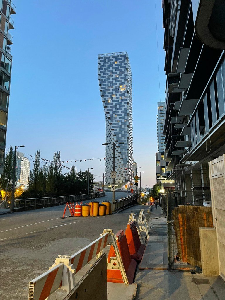
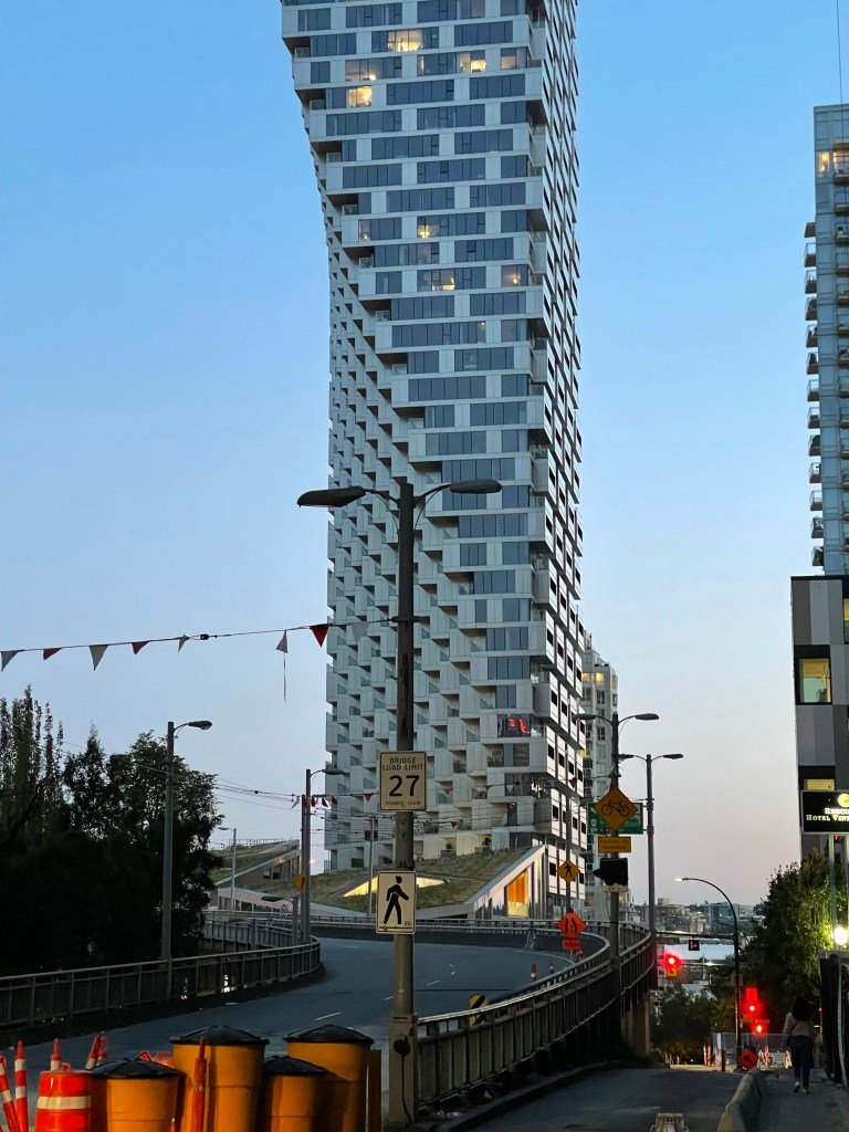
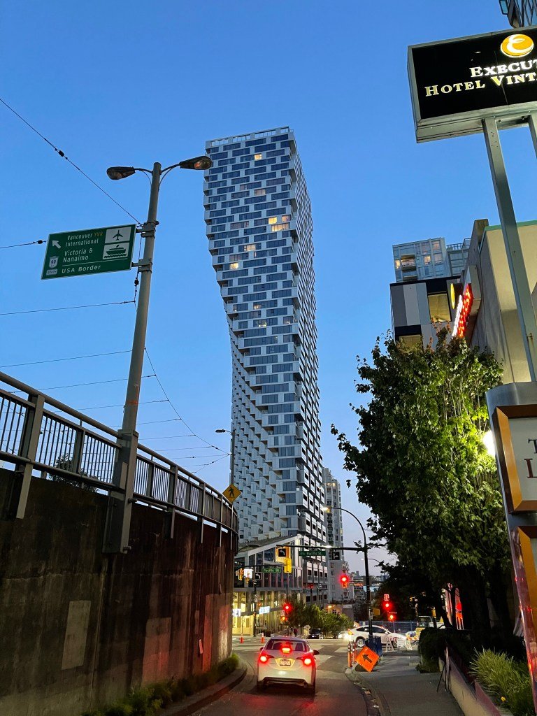
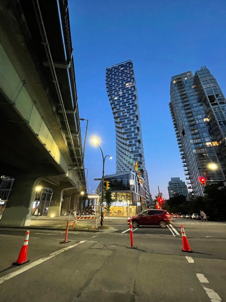
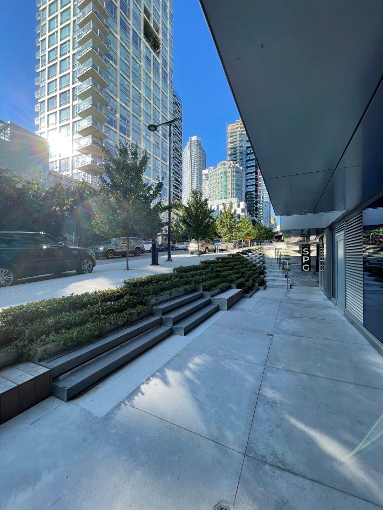
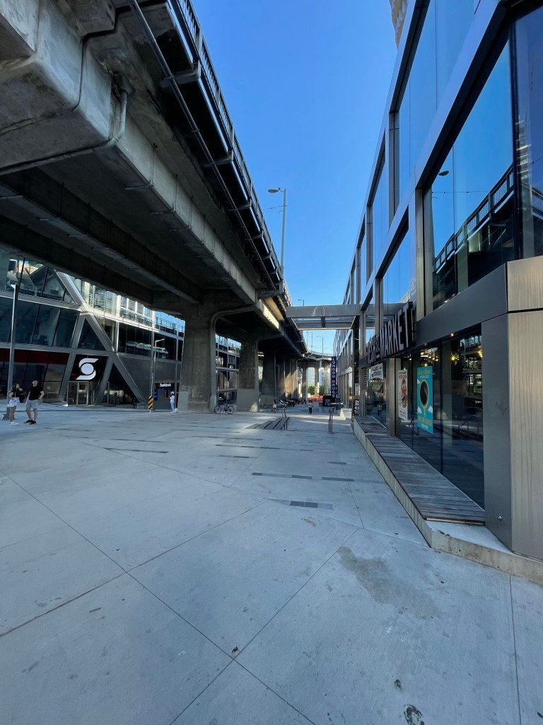
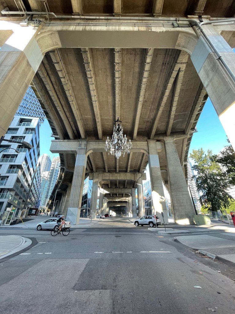
    Vancouver House is such a wonderful example of great city building. It’s an awkward site hugging the off ramps of the Granville Street bridge. It’s less than ideal.

    And yet Westbank (developer) and Bjarke Ingels Group (architect) have turned it into something remarkable. The tower is incredibly unique, though it is not form for the sake of form. It is a direct result of the site’s setback constraints.

    But perhaps more importantly, the project manages to activate the ground plane and underneath the off ramps through its architecture, a mix of uses (retail and office) and a giant chandelier.

    So if you happen to find yourself in Vancouver, I would encourage you to visit the Beach District and do a walking tour of Vancouver House.

    There’s also a great Italian restaurant in the base of the tower (Autostrada Osteria) that you should try once you’ve finished your tour.