Daily insights for city builders, delivered every morning at 6 AM ET. I’m Brandon Donnelly — a Toronto-based real estate developer and founder of Globizen. I’ve been writing here since 2013.

Category: Design

  • Celebrating Stool 60

    This stool, Stool 60, was originally designed in 1933 by celebrated Finnish architect Alvar Aalto. And it’s pretty much perfect, which is why the design has remained untouched for almost a century. But here’s an interesting collaboration. Wood Wood — a Danish streetwear and design company — approached Artek — the furniture company that Aalto, his wife, and others founded — to see if they could experiment with different color stains for the stool. The objective was to still allow the natural grain of the birch to come through, but to also add some color, so as to get people to relook and what is for many people a very familiar piece of furniture. The result is three new colours: bothnia blue, powder pink, and factory yellow. I think they’re beautiful. There is also a good story behind them. And isn’t that often what we end up buying — a narrative?

    Image: Wood Wood

  • Modern luxury

    “Luxury” is an overused term in the world of real estate. If you call everything luxury, then ultimately nothing is luxury, right? But let’s ignore this particular debate for right now. I was recently in a meeting where our interior design team — Mason Studio — made what I think is an important distinction between “classic luxury” and “modern luxury.”

    Classic luxury is old school luxury. It is the kind of luxury that says, “you can’t come in here unless you look like this.” And I’m sure that all of you can think of brands that might speak to you in this way.

    But I think this idea of luxury is quickly changing. Perhaps a good example of “modern luxury” is the recent collaboration between RTFKT — the web3 digital fashion company that Nike bought last year — and high-end luggage company RIMOWA.

    This, to me, is a brilliant collaboration. It is a sign of what’s to come — an ongoing blurring of our physical and digital worlds — and it is a less fussy kind of luxury; maybe I’ll mint an exceptionally expensive piece of luggage, maybe I’ll mint a digital collectible, or maybe I’ll just hang out on Discord.

    Now, one could argue that nothing has really changed and we’re just talking about different kinds of trappings. But that doesn’t feel exactly right. There is something about modern luxury that feels more inclusive to me. And I think that is why it is quickly becoming the dominant form of “luxury” — whatever that means.

  • 3 things about Le Corbusier’s Cité Radieuse

    I have written about Le Corbusier’s Cité Radieuse in Marseille many times before on the blog. It is one of the most influential multi-unit buildings of the 20th century. For better and for worse, it inspired a generation of architects. But up until this afternoon, I had yet to actually see it in person. Now that I have, here are 3 takeaways.

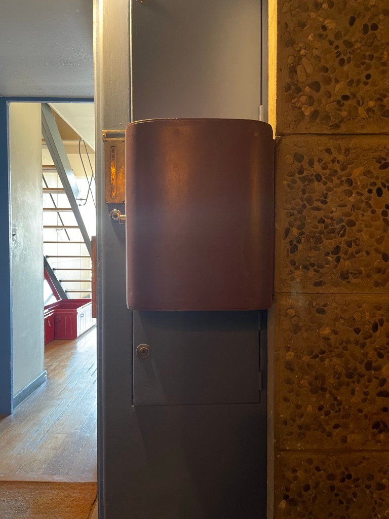
    The corridors throughout the building were thought of as “streets” in a vertical village. Because of this, each street had a mailbox and each front door came equipped with an elaborate delivery system. The large curvy thing pictured above was for general deliveries (mostly food I’m guessing). And the smaller door below was for ice block deliveries (i.e. refrigeration). In both cases, these doors could be accessed from inside the kitchen.

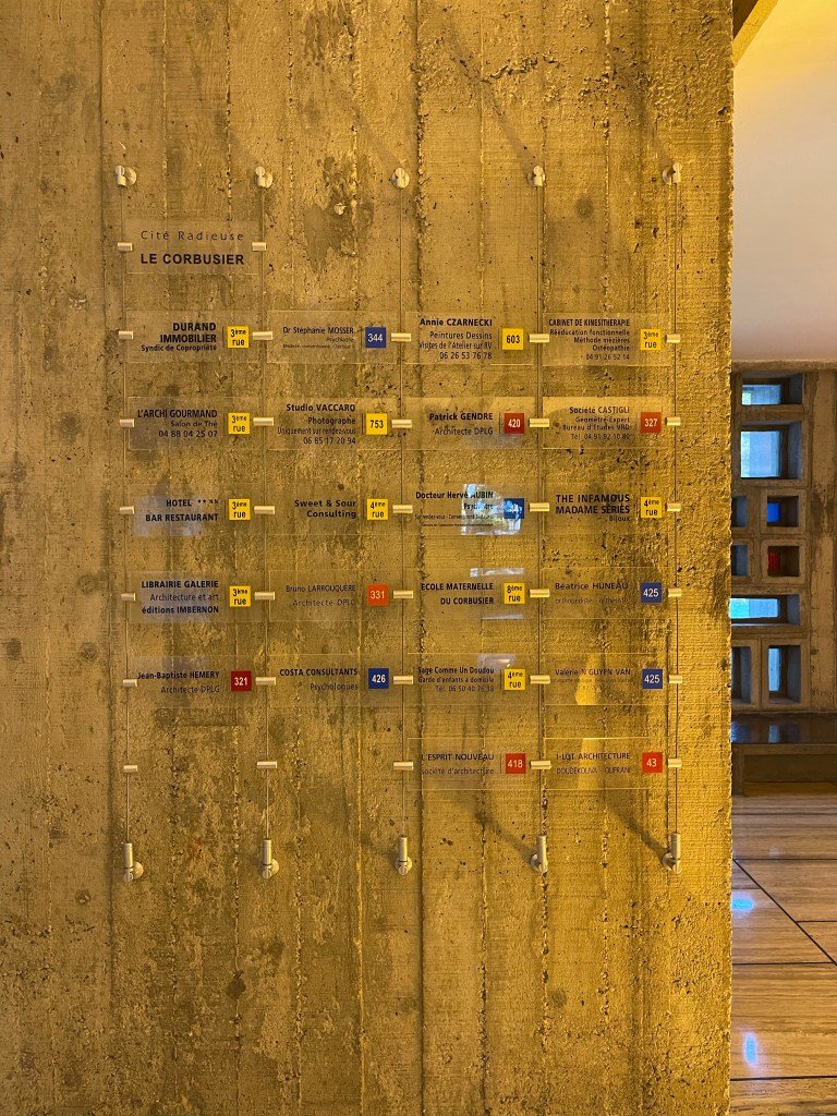
    The two “streets” in the middle of the building were dedicated to commercial uses. And by being in the middle of the building, they were equidistant from residents living either above or below. I was told that when the building first opened in the 1950s, these streets were actually quite successful — filled with everything from bakeries to grocery stores. So you can imagine people running deliveries up and down to the other streets. But that quickly fell off as the retailing landscape developed in Marseille and in France. Today, this portion of the building houses mostly offices, art galleries, and specialty boutiques. Though there remains a widely-used 21-room hotel (pictured above).

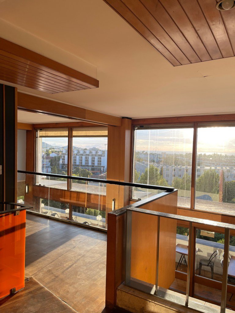
    To fully appreciate what the Cité Radieuse meant for housing in France, you kind of have to imagine what the rest of its stock was like at that time. The introduction of duplex and dual aspect units with modern kitchens and bathrooms and with views of the sea, represented meaningful progress at the time. But it is interesting to see how much ceiling heights have changed over the years. They’re really low here — well under 8 feet. And that is probably its greatest Achilles’ heel today.

    If ever you happen to find yourself in Marseille, I would encourage a visit to the Cité Radieuse. Many of the things we do today started in this building. And there are some other ideas here that might also be worth bringing back.

  • The Local Project

    Regular readers of this blog will know that I am huge fan of the YouTube channel Never Too Small. I have seen most of their episodes and I like to tell people about it even when it is only remotely related to the conversation at hand.

    I love the urbanity of it all. There is just something so satisfying about turning constrained spaces into homes that are both beautiful and functional. It also makes you question how much space you really need.

    But if constraints aren’t your thing, and you’d like to see a wider variety of homes, another great channel to check out is The Local Project. The homes — which are all in Australia and New Zealand — are equally as beautiful, but tend to be more, uh, extensive. See above video.

    What are some other channels worth checking out? It seems to me like Canada needs something similar to The Local Project. Maybe it already exists.

  • The fast-foodification of cities

    Greg Isenberg recently wrote about what he refers to as the fast-foodification of everything — including cities. His arguments are that (1) we have reached peak sameness (Toronto is largely indistinguishable from, say, Sydney) and (2) the best brands and companies going forward will be local, unique, and community-driven.

    I don’t know how to assess whether we have reached peak sameness, but I do know that, whatever we are experiencing right now, is at a minimum 100 years in the making. The International Style (of architecture), which emerged after WWI, is exactly what the name suggests. The intent was to fashion an approach to architecture that worked anywhere in the world. Location, climate, and context were all irrelevant.

    This approach has been widely criticized for the reasons you might expect and for the reasons that Isenberg outlines in his post. But sameness is not exclusively the result of European architects who wanted to eschew ornament and local flourishes. As the world continues to globalize and become “smaller”, there is an inevitability to this growing and continued sameness. Business wants economies of scale.

    But there is no question that, more than ever, people are craving unique and local experiences and places. And if you can create that in our globalized world, you are going to win.

  • Learning from Lisbon

    This happened earlier in the week:

    And it got me thinking about how much I love Lisbon:

    But the important story here is that these tweets made it abundantly clear to me that (1) people from all over want far more from their parks and public spaces and that (2) Lisbon’s kiosks are a truly beloved urban feature.

    I’m putting this all out there because I received a ton of inbounds following these tweets, and I would love to find a way to execute on the kiosk idea that I outlined in the above twitter thread. So if you’d like to help, please continue to get in touch.

  • We love you

    I was in New York today for meetings. Our office is next to the 9/11 memorial pools and so I walked over with a colleague during lunch. It was my first time visiting the completed memorials and it was hard not to feel things as I stood there watching the water fall into the mysterious squares in the middle of each pool. But even more impactful were the flowers that people have inserted into the various names, and the messages that they have left for their loved ones.

  • Does off-site construction equal more compromises?

    We have been talking about prefabricated and modular buildings for so long that it’s easy to think it might never happen. (Here’s a related post that I wrote back in 2015.) There are also lots of groups that have tried and failed. Perhaps the most high profile is the bankruptcy of off-site construction company Katerra, which had raised some $2 billion in funding, but for whatever reason(s) couldn’t figure things out.

    That said, I’m starting to get the feeling that change might actually be underway in our industry. Over the last few months we’ve been talking about startups like Nabr. But there are many others, including Factory OS, which has been quietly building affordable housing in California (presumably far away from here). To date, they have completed 10 buildings and over 1,200 units, and they have another 24 or so buildings in the pipeline.

    This feels promising to me. And I think it’s being aided by our current environment — costs are way up and people are desperately searching for efficiencies. But if this is really going to transform our industry, I think we’re going to need to be willing to make some sacrifices. Standardization and efficiency likely means making some concessions around design and overall specificity. Not every project can be custom, as is generally the case today.

    That likely means that cities and communities will also need to become more forgiving when it comes to urban design guidelines. Could you please step your building back right here and follow this oblique angle that lines up with this important historic datum line? Nope, sorry, can’t. Our production line can’t accommodate that sort of change. Would you like the most affordable housing possible with today’s means or would you like a custom design?

  • Toilet seat heights in Amsterdam

    I am in Amsterdam right now for the very first time. And after I took in all the bicycles, the beautifully tilting buildings, and its iconic canals, the first thing that struck me was — get this — the height of its toilet seats.

    Now don’t get me wrong, I am a reasonably tall guy. So it’s not that the bowl in my hotel room isn’t comfortable or anything like that. It actually feels quite luxurious. I just know that this thing has got to be taller than your average bowl.

    A typical toilet seat height can be anywhere from 15 to 19” when measuring from the floor to the top of the seat. But I think 17-19” is the most typical range. So how much taller is my Dutch bowl?

    Sadly, I forgot to pack my tape measure on this trip. So I instead used the tallest book I could find in the room as a measuring stick. It happenend to be the above book by Hollywood photographer Matthew Rolston.

    Matthew’s book is 36cm tall and so, by using everything I ever learned in architecture school, I am now fairly confident that my seat is currently sitting at around 21-22” off the ground.

    Dutch people are tall. And so too are the bowls, it would seem.

  • Project Profile: Social housing in Vienna by trans_city architecture

    I stumbled upon this multi-unit housing project in Vienna because I thought it looked beautiful and I started thinking about the solid wall-to-window ratio on its facades. But it turns out that this project is far more than just a pretty face.

    It’s actually a social housing project on the outskirts of Vienna, where the city transitions into the countryside. And it incorporates a number of interesting design features:

    • The complex is heated using groundwater heat pumps (geothermal) and domestic hot water is provided with the help of rooftop solar panels.
    • The structural system consists of concrete slabs and columns (no shear walls) and was all poured in place. But the envelope consists of “prefabricated thermo-brick walls” which were craned into place (see below image). The curving balconies also look to be prefabricated elements.
    • The suites have been designed with a saw tooth pattern and the circulation mirrors this through a zig zagging pattern. The result is units that are akin to what you will find at King Toronto (Bjarke Ingels), though on average the suites here look to be bigger than what we typically design in Toronto.
    • The zig zagging corridors also incorporate skylights that let light down into the middle of the building. I think these run through multiple floors as well, and not just through the top floor of the building.

    This certainly looks like a nice place to live.

    Sources: Architecture by trans_city (Christian Aulinger, Mark Gilbert). Photography by Daniel Hawelka and David Schreyer. Both via ArchDaily.