Daily insights for city builders, delivered every morning at 6 AM ET. I’m Brandon Donnelly — a Toronto-based real estate developer and founder of Globizen. I’ve been writing here since 2013.

Month: November 2019

  • Ride hailing in Toronto

    Earlier this year, the University of Toronto Transportation Research Institute (UTTRI) published this report on the impacts of ride hailing services in the City of Toronto.

    And then today, the Ryerson City Building Institute leveraged it to opine on how “on-demand tech” might improve transit going forward. That’s how I discovered it.

    What is clear from the report is that ride-hailing services — which they refer to as Private Transportation Companies (PTC) — are driven by two dominant use cases: 1) going out at night and 2) commuting to and from work.

    Friday and Saturday nights are by far the busiest periods for PTC travel, with the peak usually happening around midnight on Sunday morning. About 13,100 trips per hour, mostly concentrated in the core.

    Overall, it is estimated that Toronto does about 176,000 daily PTC trips (as of March 2019). That places it behind New York and Chicago in terms of the size of the market. But Toronto also didn’t complete its first PTC until 2014. Here’s a comparison chart:

    Another diagram that I found interesting was the proportion of shared ride trips by neighborhood. It shows that much of the inner suburbs are hailing shared rides — sometimes as high as 45% of all trips. This is interesting because it is people effectively gaming the system.

    Because the population densities are lower in the suburbs than in the core, you’re a lot less likely to get paired with other riders when you select that option. So what tends to happen is that you end up getting a private ride for the price of shared ride. I know I’ve played the odds before.

    If you’d like to download a full copy of the report, click here.

  • An apartment dwelling city

    Toronto’s Chief Planner, Gregg Lintern, posted this on Twitter a few days (if you can’t see it below, click here):

    A couple things came to mind when I saw this.

    First, it’s a reminder that census data is painfully slow. Five years is a long time and a lot can and will change during that time period, including the kind of built form that people are living in.

    Second, I agree with Gregg. Toronto is in the process of transforming into a majority apartment/condo dwelling city (if it hasn’t already), and it signals a pretty important juncture in our city’s history.

    It also begs an important question: How should our planning response change and adjust as this percentage of urban dwellers continues to creep upward?

  • birdO, StreetARToronto, and Slate unveil new 10-storey mural at Yonge and St. Clair

    This blog has been a little too serious as of late. So here’s something fun. Last week, Toronto street artist birdO, StreetARToronto, and Slate Asset Management unveiled the new 10-storey mural that I wrote about last month. The large-format art piece is part of the City of Toronto’s StreetARToronto Monumental Program and our (Slate’s) ongoing effort to do things that are great and remarkable at Yonge and St. Clair. Below are some photos of the mural by Riley Snelling. I love how these turned out (birdO in his bird mask, of course, helps make them).

    For the full press release, click here.

    Photos: Riley Snelling

  • EV and ICE vehicles expected to reach price parity by mid-2020s

    Each year, Bloomberg NEF (New Energy Finance) publishes a long-term forecast of how electric vehicles and shared mobility will/might impact our cities. Predicting the future is never easy. And forecasts are never right. But they’re valuable to do.

    By 2040, BNEF believes that 57% of global passenger vehicle sales and 30% of the global passenger vehicle fleet will have some form of an electric drivetrain. Either full battery electric (BEV) or plug-in-hybrid electric (PHEV). Looking at this another way, we have about 17 years (2037) until ICE and electric vehicles are expected to intersect and hit 50/50 in terms of global sales.

    A big part of what is driving the adoption of electric vehicles is that the price of lithium-ion batteries keeps coming down. Assuming this trend continues, the price of EVs and ICE vehicles (in most segments) should reach parity sometime in the mid-2020s. Meaning, yes, it’s more expensive to produce an EV today.

    All of this will also impact mobility services (ride-hailing and ride-sharing). Today, less than 5% of annual kilometers traveled by passenger vehicles around the world is thought to be done through some form of a ride-hailing app. That’s still a pretty significant number, actually. Though only about 1.8% of this fleet is electric.

    By 2040, shared mobility services are expected to rise to 19% (see above) and — because their costs are coming down — 80% of this fleet is expected to be electric. Autonomous vehicles are not expected to meaningfully impact global mobility until the 2030s. But the growth in shared mobility services is still expected to reduce the demand for car ownership, and likely parking.

    Other high-level findings from BNEF’s 2019 Electric Vehicle Outlook can be found here. If you want to access the full report, you’ll need to be a BNEF client.

    Images: Electric Vehicle Outlook 2019 (BNEF)

  • Holding back the sea, in Venice, maybe

    Venice has been keeping flood records for 150 years, though it is generally understood that the city has been regularly flooding since the very beginning. It usually happens between the fall and the spring and the earliest record is believed to be from the 6th century.

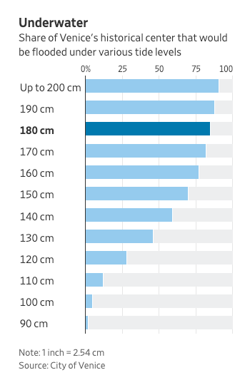
    This past week, Venice saw its acqua alta (or high water) peak at 187cm (6’2″) above its normal level. This is the second highest number on record and is just below its 1966 peak. At these numbers, about 80% of the historic center is underwater. Here is a chart from the WSJ explaining that:

    Venice has been working on a flood management project called MOSE since the 1980s. The name is an acronym, but there’s a deliberate biblical reference here. Remember when Moses parted the red sea?

    The project has been mired in engineering delays and corruption scandals, and so it’s not yet operational. If it were, it would have, in theory, protected the city this past week. 2022 is the anticipated completion date, but I don’t know if that’s realistic or not.

    The system consists of 78 mobile gates that fill with water and sit flat on the seabed when the tide is low. When a high tide is predicted, the gates are then to be pumped with air so that they rise (hinged on one side) and close off the three inlets that connect the Venetian Lagoon to the Adriatic Sea.

    As I was reading about this project and everything else that has been going on in Venice this past week, I became curious about how exactly the Dutch have been managing to hold back the sea. I mean, a big chunk of the Netherlands sits below sea level.

    If you’re also curious, here’s a video that explains how they do it.

  • Shadow Stalker

    The Shed in Hudson Yards has an exhibition on right now called Manual Override. It features the work of five artists. One of those artists is Lynn Hershman Leeson, who is known for exploring the relationship between humans and technology (naturally, she lives in the Bay Area). Her piece at the exhibition is called Shadow Stalker.

    The way Shadow Stalker works is that you enter your email address — a single data point. The installation then pulls up all of the publicly accessible information associated with your email address. Things like your name, age, address, phone numbers, where you were last seen, and more.

    She refers to this information as your “digital shadow.” It is all of the personal information that is publicly accessible because of the internet. And it is the kind of the information that is already used for things like “predictive policing.” Software that predicts where crime is likely to occur.

    I am fairly public as a result of this blog. Already this year I have written over 75,000 words. So I can only imagine what the internet knows about me. Probably a lot. But of course, I am volunteering a lot of this information. What does the internet know about us that we didn’t explicitly tell it?

    If you’re interested in learning more about Shadow Stalker, here’s a video.

  • A comparative analysis of global cities

    Since 2005, LSE Cities (London School of Economics) has been collecting comparative data on how global cities perform in terms of key spatial, socioeconomic, and environmental indicators.

    This is their latest data matrix:

    To be clear, it is not a ranking of cities. It is intended to help us better understand how different cities around the world are performing.

    Depending on how you’re consuming this post, the text may be difficult to read. So here’s what each column represents, moving from left to right:

    • Current population in the administrative city (millions)
    • Current population in the urban agglomeration (millions)
    • Average hourly population growth of urban agglomeration 2015 to 2030 (people per hour)
    • Administrative city area (km2)
    • Average density of built-up administrative area (people/km2)
    • GDP per capita in urban area ($, PPP)
    • Percentage of country’s GDP produced by the metro region
    • Population under 20 (%)
    • Murder rate (homicides per 100,000 inhabitants)
    • Percentage of daily trips made by public transport
    • Percentage of daily trips made by walking & cycling
    • Car ownership rate (per 1,000 inhabitants)
    • CO2 emissions (tonnes per capita)

    If you’d prefer to download a full PDF of the chart, click here.

  • The global average fertility rate is decreasing

    According to this recent Bloomberg article, the world is expected to add more than 3 billion people by 2100. At the same time, the global average fertility rate is dropping. In 1960, it was five live births per woman. As of 2017, it had dropped to 2.43.

    About half of all countries are now below the rate of replacement, which means they’re relying on immigration (places like Canada) and/or they’re relying on labor productivity gains to keep their economy growing (places like China).

    The article is also fascinating in that it begins to consider the economic and cultural forces that shape the above fertility rates. Women in Saudi Arabia, for example, have one of the lowest labor force participation rates in the world. Only about 25% are in the workforce.

    If you’d like to read the full article, you can do that here.

    Image: Bloomberg

  • An all-women development team

    My good friend Taya Cook (of Urban Capital) and her development partner Sherry Larjani were featured in the New York Times today as a result of their Reina project and their remarkable efforts to gender balance the male-dominated commercial real estate industry. I am thrilled that their work is getting the attention that it deserves.

    Here’s an excerpt:

    That’s because, despite progress in many other professional realms, women remain severely underrepresented in real estate development and investment, particularly in senior roles.

    Women held just 4 percent of senior investment roles at major real estate firms, according to a widely circulated 2011 study, and their numbers have improved only “marginally” since, said the study’s author, Nori Gerardo Lietz, who is a senior lecturer at Harvard Business School and a longtime real estate investor.

    Ms. Lietz reviewed the senior ranks of 82 major real estate investment firms for the study, as well as many more private equity and venture capital firms, and found that women were noticeably absent from the most highly paid, “touch the money” jobs.

    For the full article, click here. And for more on Reina Condos, click here.

  • The anatomy of density

    Urban environments can be dense in many different ways. This is a topic that we have discussed on several occasions here on the blog. But this working paper by Solly Angel, Patrick Lamson-Hall, and Zeltia Gonzales Blanco — called The Anatomy of Density — is a more scientific way of looking at it. They have come up with six measurable factors that, when combined, define urban density.

    What this means is that cities achieve urban density through different kinds of built form. Hong Kong, for example, gets its density from height, even though only about 4% of its land area is occupied by residential buildings. Dhaka, on the other hand, does it through low building heights and high residential coverage. Homes occupy about 20% of the city’s area. Another dimension is crowding.

    But here’s something that may surprise you. Most cities are actually becoming less densely populated. And, despite our best efforts to encourage more sustainable forms of development, sprawl has continued to outpace densification in the vast majority of the urban agglomerations that were studied as part of this working paper. The wealthier we become, the more space we want to consume.

    Here’s a graph from The Economist that speaks to this trend:

    To download a copy of the working paper, click here.

    Image: The Economist