
Aaron Terrazas, who is a Senior Economist at Zillow, recently gave this presentation about the US and Virginia Beach housing markets. (I discovered it through City Observatory.)
There are a bunch of interesting graphs/stats in the presentation. Home values in Virginia Beach, for example, have yet to fully recover from the 2007-2008 financial crisis. They are still 8% below their pre-crisis peak, which was in July 2007. (I presume the presentation is dealing in nominal dollars.)
I’ll give two more examples.
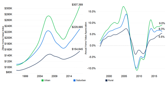
Below is a chart comparing average home prices for rural (dark blue/purple), suburban (blue), and urban (green) homes. In the late 90′s, suburban and urban homes were roughly equal in terms of average prices. But since then, urban homes have shown greater appreciation. The spread also appears to be widening.
And here is a graph showing the share of mortgage borrowers in a negative equity position. That is, the value of the home is less than the outstanding balance of the mortgage.
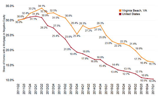
Now this is only covers people who have a mortgage. According to this Washington Post article, about 34% of all US homeowners don’t have one. Either they have paid it off or they never had one.
Still, the above numbers stood out to me. They speak to the severity of the financial crisis. At the end of 2011 and the beginning of 2012, over 30% of borrowers were in a negativity equity position. And in Virginia Beach it was more than 1/3 of all borrowers at the peak.
For the full presentation, click here.
